Text Rotation with CSS
Once again, after reading somebody else's article, I felt inspired to put together an alternative example. In this case: Text Rotation.
Within the article I linked to, the example uses an image sprite and a sprinkle of CSS to get things positioned right. Well, maybe not so much a sprinkle. It's like the top fell off the pepper shaker and you've suddenly got a large pile of pepper on your food. It makes me want to sneeze.
Thankfully, many of the popular browsers of today support the ability to rotate HTML elements. Even better? We can make it work in Internet Explorer (back to version 5.5 even). How you might ask? Okay, let's look at the HTML.
<div class="example-date">
  <span class="day">31</span>
  <span class="month">July</span>
  <span class="year">2009</span>
</div>
Nice and clean without too many extras. I conscientiously chose the date order I did to avoid having to use a comma. Otherwise, an extra span would be required to remove the comma from our final design.
The Magical CSS
For Webkit and Firefox (as of 3.5), you can take advantage of the proposed transform property to handle the rotation. Each browser requires its property prefix for now.
-webkit-transform: rotate(-90deg);
-moz-transform: rotate(-90deg);
In order to perform a transformation, the element has to be set to display:block. In this case, just add the declaration to the span that you want to rotate.
When it comes to effects in Internet Explorer, there is a surprising amount of power (and untapped at that, I'd say) in using filters. Although misleading, there is a filter called BasicImage that offers up the ability to rotate any element that has layout.
filter: progid:DXImageTransform.Microsoft.BasicImage(rotation=3);The rotation property of the BasicImage filter can accept one of four values: 0, 1, 2, or 3 which will rotate the element 0, 90, 180 or 270 degress respectively.
The BasicImage filter has other properties that can be set such as mirroring, masking, greyscale and others. Alternatively, you can take advantage of the Matrix filter but the coordinates still don't make any sense to me.
In action
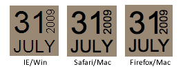
What does this look like in action? Take a look at this page in Safari, Firefox or Internet Explorer and you should see something that looks like the following image. Probably the biggest downfall is the lack of consistency in text rendering. Internet Explorer will drop ClearType on any text that has a filter applied to it. You can also see the spacing between the day and the year is different between Safari and Firefox. The differences in text rendering make it more difficult to create "pixel perfect" layout.
Here's hoping the article has offered up a little inspiration and shown that even IE has a few tricks up its sleeve, allowing us to pull off some layout fun.
Conversation
Wow, this is awesome! Will be very useful!
Thanks for posting this!
I remember I was struggling to do the same, several years ago - then it worked only in IE with basic image filter and didn't work on any other browsers.
Awesome Article, very useful!!
I'm literally stunned that this is possible in IE.
This is useful
Tks @snookca
ha. this is so awesome. i was just oooh-ing over Chris Coyer's tutorial from today (http://css-tricks.com/date-display-with-sprites/), but leave it up to Snook to come through with some old school BasicImage hacks! I hope squarespace pays you the big bucks.
I recently tried this with my personal vcard site (linked in my name) but had real trouble with IE turning off cleartype using rotate and opacity. The rendering ended up looking so bad I reverted back to images as you can see. And even then switching on opacity in IE on PNG images causes bad rendering.
We are destined never to have full support for this stuff :(
I can't believe this is supported by IE 5.5... amazing. Thanks for the insight snook
Good post. Certainly opened my ignorantly closed eyes with regard to Internet Explorer. I will have to take a look more at some of those IE filters now. Thanks for sharing.
Ha! Perfect timing. I was just reading the css sprite article & considering implementing that concept for date formatting on a site I'm working on, but was too lazy to put together a sprite sheet. :) I'll give this a shot though.
wow, that's great! I'm thinking of a lot of uses for that. It's not working in Opera though.
Much better than the other site you linked to...thanks for explaining the proper way to do this.
I knew there was a reason I followed you on Twitter. A real gem, thanks ;)
Sweet, thanks a bunch Snook!
Awesome!
I would be interested in finding out where you came across the filter for IE. Is there a list available somewhere?
It looks like it does not works on FF 3.5 debian
@Ollie: Agreed, it's unfortunate that it has to destroy ClearType just to apply an effect. It certainly means that you'd have to be more careful with your type choices to ensure a decent rendering for IE.
@David Rojas: Yeah, no Opera support as far as I know. I'm not sure if they plan to implement CSS transformations at any point.
@Korri: That's interesting that there are features that aren't available on that platform. That could be frustrating, that's for sure.
Given the -ms-filter extension in IE8 http://msdn.microsoft.com/en-us/library/ms533754%28VS.85%29.aspx I'd expect that there's probably a few other Visual Filters that can help bridge the CSS3 gaps such as DropShadow()*. It probably should go without saying that you should be careful about what you put filters on for performance reasons.
*Full Visual Filter reference at http://msdn.microsoft.com/en-us/library/ms532853%28VS.85%29.aspx
Awesome article. I was literally just looking at the technique you alluded to this morning, but your approach here is so much nicer. Thanks alot.
I was thinking about how to do this in a header menu last week with images, now i can start to develop without any!
Another breakthrough for web design. If the browser can understand javascript it should be able to do things like this with CSS transform. Including IE<- "The odd man out".
Thanks to you and Mr.Coyier for this.
I link to an article I think is a good resource and then here comes Jonathan with a 1up on said article. No wonder you're winning the Happy Webbies contest so far. :)
Well, the sprite thing is something we had to learn. But personally I'm not comfortable using a large stylesheet to define a big list of sprite coordinates for such a little thing. I'm much more interested in some more efficient ways to do so like the one I found at is.gd/1RgZU
It's pretty much a hack that will break CSS2.1 validation (who cares), but stay tuned to CSS3.
Nevermind, I wanted to post this on other blog's comments Sorry. This is the efficient one
Waho...
Amazing possibilities...
Great article !
Not working here...
Windows 7 - Firefox 3.0.12
pic
Windows 7 - IE 8.0.7100.0
pic
That's a great solution for those who have images disabled. The solution on CSS-Tricks, while it looks great, pushed the text -1000em to the left.
@gWarez: Definitely won't work in Firefox 3.0. -moz-transform only got introduced in 3.5 (I mention this mid article but easy to miss). As for IE8 on Win7, my guess is that it needs the alternate syntax: -ms-filter and wrap the value in quotes. It was working on my version of IE8 so I didn't bother expanding on that approach.
I'm at a loss for words. I had no idea you could do something like this in IE 5.5. Great old school filter example, I love it!
Bookmarked your site for later. I'm going to have a peek around.
http://bolknote.ru/2006/12/16/~330
2006 year
Nice article.
I just read the article on css-tricks and I must say both ideas are interesting.
Excellent work. Will be very helpful in the future!
I had written about this here: http://developer.cmzmedia.com/?p=368
Yep, the clue was in the title of the other article (which I too read first), but your technique was the one that sprung to my mind. It wouldn't bother me about IE support although this is a bonus - definitely something from my progressive enhancement toolbox.
I was wondering about the possibility of rotating text with CSS. Found this page via twitter. Thanks for the write up!
Doesn't work in FF 3.0.12 in XP 64 either.
I've been using rotate transformations on my new website’s contact form: http://douglasheriot.com/#contact
If you’re using a browser that supports it, there will be a “super fun fun button†at the bottom, which animates the contact form spinning around!
I haven’t made mine work in Internet Explorer yet though. It sounds like I would have to use the matrix transform filter, as I need more that 90° increments.
This is BIG man, I mean designers will have a great time with this method.
Thanks!
C
People have been beating up IE6, for not having this or that support, for so long that they can't believe it DOES have support for a wide range of effects. It's proprietary and confusing and from ten years ago, but it can help.
Myself, I've only tried some of the basics. There's a lot in there to see. I'll have to try more in the future, when I'm running into difficulties with the IEs.
Thanks for sharing this!
A simpler and non-filter way to achieve vertical text in IE browser is the CSS property "writing-mode: tb-rl;" obeys clear-type in my test.
I think rotation of "text" is best handled by writing mode property as some languages also are written from top to bottom. Rotation however can be applied to DIVs; spans and such.
Last checked FireFox may support writing mode in future releases.
hey !
Thanks for this but it seems it doesn't work in opera browzer :(
any suggestions ?
Your website is really great !!
I'd also include the line
transform: rotate(-90deg);
Even if transform isn't official yet, some browsers may already support it (maybe Opera, they're usually the first with those sort of things), and one day all browsers will support it, like opacity today.
Yes, I'll add the standard CSS3 properties to this (It probably won't change in the final TR), to ensure interoperability for CSS3 compliant browsers which need no specific layout engine hacks:
Note that the default pivot point is
which should be just fine here (didn't tested).
Finally, we can do cross-browser horizontal accordion components without images!
Well, once Firefox 3.0 is at appropriately low levels of usage.
Thanks for the article! Came in handy already :)
Very cool, now I just need to get to work building an entire website sideways!
Excellent post. Really clean approach and amazed that something like this can even work in IE! Not that I'll ever switch back from Firefox!
Not looking too great on IE 8 w/Vista. The 2009 appears to the right outside of the brown box.
Hah, you must have been as bored as I was yesterday as I too felt inspired to try a different variation based on the same article you referenced.
You mentioned there being a whole pile of CSS needed when using sprites? True, but this variation takes care of that.
That's kind of funny that Firefox is the one lacking behind.
I can't get any version of this working in IE8 (compatibility on and off), FF 3.5 and Chrome... Can anyone post a snippet of a 100% complete html that does this? Here is what I tested based on inspecting the html here:
@myself -- duh. in style block, replace ".example-month" with ".month", ".example-day" with ".day", ".example-year" with ".year".
Ashish: your suggestion of using the
writing-modeproperty appeals to me, but note that it won't exactly yield the same results in this particular case because it causes the year text to be rotated in the wrong direction (+90 degrees instead of -90 degrees)Use
to add support for IE8 Standards mode
Jonathan,
Good writeup. Thanks for the article.
You can get the text of the filtered element to clean up if you give the element a background color. For example: background-color:#998877; It's a fix that cleans up most filter display issues.
I also found that explicitly setting the font size on the element to font-size:1.1em; gives a more consistent size across browsers. It may take a little css filtering to get a constant position though. :-)
Below is joe larson's version with my changes. Enjoy!
Again, thanks for the writeup Jonathan.
<!DOCTYPE html> <html> <head> <style type="text/css"> .example-date { background-color:#998877; float:right; margin-left:10px; padding:45px 5px 0; position:relative; } .example-date .day { font-size:45px; left:5px; line-height:45px; position:absolute; top:0; } .example-date .month { font-size:25px; text-transform:uppercase; } .example-date .year { -webkit-transform: rotate(-90deg); -moz-transform: rotate(-90deg); filter: progid:DXImageTransform.Microsoft.BasicImage(rotation=3); display:block; font-size:1.1em; background-color:#998877; position:absolute; right:0px; top:10px; } </style> </head> <body> <div class="example-date"> <span class="day">31</span> <span class="month">July</span> <span class="year">2009</span> </div> </body> </html>Rotation was introduced in Internet Explorer 4, with the nicer "flip" syntax:
http://msdn.microsoft.com/en-us/library/ms532847(VS.85).aspx
http://web.archive.org/web/19980201041517/www.dhtmlzone.com/articles/dhtmloverview.html
But this was a situation where only some developers designed for such a subset of browser, and where audience members rebelled at the "Works Best in Browser X" tag.
The above syntax is already verbose, but will require another clause once this behavior is standardized.
I know some folks online have a religious objection to Flash, but when you stop to think things through....
jd/adobe
Snook, Is there any fix for the same in mozilla browsers?
Amazed to see its working IE6!!!
Thanks
Subin
Doesn't work - Mac 10.4.11 Firefox 3.0.12
Nice trick, too bad this doesn't validate at all for now.
In IE7 (I haven't tested others), it looks like the trick of adding a background colour to the .example-year seems to fix up the ClearType issue:
Could something similar be achieved in IE using -ms-writing-mode without using a filter?
More info about -ms-writing-mode : http://msdn.microsoft.com/en-us/library/ms531187(VS.85).aspx
search the google then find your site.
that is a really excellent post.
Thanks for the post.
Nice tip, it works fine in IE6 but unfortunately the 2009 is not slanted in FireFox version 3.0.12
Wow! I had no idea you could do that!
Thanks for posting about it. I'll be sure to consider this in my next design.
really this is dream comes true.
I was searching for this kindo code since long.
Thanks very much.
Keep going.
Nice cross-browser overview.
As for the WebKit, this functionality has been there for quite some time now. I blogged about CSS transitions 2 years. You can basically animate the whole rotation in conjunction with CSS transforms (test-cases only work in WebKit).
Let's hope it will soon leave the Working Draft of W3C and we'll get to use these properties in an uniform way.
Very nice tip! I will use it in my next blog design ;)
Thx
Keep up the nice articles
While you're at it Jonathon, maybe you could use the
tags and experiment with HTML5?
Typo on your name there, my bad :)
Awesome article, cheers!
Very nicely written. This is cool stuff!
Wow this is a power bit of code:
-webkit-transform: rotate(-90deg);
-moz-transform: rotate(-90deg);
I need something just like this for the realigning i'm doing right now.
It is amazing how much of the stuff we are seeing in CSS recently was done by Microsoft via proprietary filters years back. Great article.
Thanks, Nicole
The above code works fine.. but it is not getting displayed in Firefox 3.0. can u please help me out.. Please it's urgent.
Thanks
Rajagopalan
I wonder if you have looked into IE 9. Does it have these same issues with antialiasing going haywire when rotated?
@Bruce: IE9 supports -ms-transform which provides finer control over the rotation and the rendering is probably one of the better text renderings cross-browser.
nice article Mr.jonathan , thanks for sharing .
Great article!
Opera still is not supporting this, even the latest version 11.01 - very sad.
Will the north star (polaris) always be the north star?
I found a solution for Opera!
You have to use a wildcard on everything within a container in order for -o-transform to work. Example:
#container * {

	-o-transform: rotate(270deg) !important;

	-o-transform-origin: 50% 50%;

}
As opposed to:
#verticaltext {

	-o-transform: rotate(270deg) !important;

	-o-transform-origin: 50% 50%;

}
(which will do nothing...)
Hi,
works great where span tag could be use.
<li><a href="#" id="issuesBI" runat="server" title=""><span>issues</span></a></li>
could I use it for rotating text in buttons ??
how could I rotate submit text in follow button code??
<li><input type="submit" name="submitButton" value="submit" onclick="return SubmitBI_Check();" id="submitButtonBI" /></li>
not able to use span tag in button/input tag :-(
Thanks in Advance
@Vimal: There's a couple options. One, best to rotate things that would normally be a block element. Rotating just the span in an anchor may be problematic. Rotating the anchor or the li may be better, depending on your design. However, you can do
<button><span></span></button>.Thx, worx great