Simplest CSS Slideshow
In continuing my exercise of tackling a simple slideshow in different ways, this challenge attempts to make a slideshow without using any JavaScript.
Thankfully, I didn’t research this first and just went with it. Yes, this has been done before by other people. Whatevs. Enjoy…
To do so, I’ll attempt to do this with CSS animations. This was trickier than expected because, well, math is hard. I knew I was dealing with certain multiples but kept screwing up the timing.
The basic premise is to have an image fade in and then fade out. I use an animation-delay to offset the animations for each subsequent image in the slideshow.
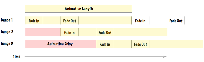
This graph visualizes how the animation duration and animation delay work.
There are 3 sets of numbers that you need to determine:
- The total
animation-duration. - The
animation-delayfor each image. - The keyframe timings.
Animation Duration
To determine the animation duration, take the fade in time that you want plus the time you want the image to be visible before beginning to fade out. If you want the image to take 1 second to fade in and be visible for 1 second and you have 3 images then your animation duration is 6 seconds.
Math: (fade-in + visible) × images = duration.
Animation Delay
The animation delay is pretty straightforward. The key thing is that you want to start the animation for the next image when the image before that is starting its fade-out. Therefore, you want the animation delay to be the fade-in time plus the visible time for the previous image. If it’s the second image and the animation should fade in for 1 second and be visible for 2 seconds before fading out then the animation delay should be 3 seconds. If it’s the third image, the delay is 6 seconds. If it’s the fourth image, the delay is 9 seconds, and so on.
Math: (fade-in + visible) × (ordinal position − 1) = delay.
Keyframes
Keyframes can be a simple from or to but for more complicated animations, we have to use percentages. Therefore, the last piece of the puzzle is figuring out how to get the animation percentages correct. To do so, we need to break up 100% into the number of seconds of our animation. If the animation is 10 seconds long then each second is 10%. If the animation is 6 seconds then each second is 16.66%. The timing then becomes a multiple of that.
Math: 100 ÷ animation duration = percentage for 1 second.
All Together
Here’s how it all comes together. In this case, I’m doing a 1 second fade-in plus 2 seconds of visibility before fading out. First, I define the CSS keyframes for a fade animation.
@keyframes fade {
  0%   { opacity: 0; }
  11.11%   { opacity: 1; }
  33.33%  { opacity: 1; }
  44.44%  { opacity: 0; }
  100% { opacity: 0; }
}
Next, I set the animation for all images.
.fadein img {
    opacity:0;
    animation-name: fade;
    animation-duration: 9s;
    animation-iteration-count: infinite;
    position:absolute;
    left:0;
    right:0;
}
Lastly, I set the animation delay for each of the images.
.fadein img:nth-child(1) { animation-delay: 0s; }
.fadein img:nth-child(2) { animation-delay: 3s; }
.fadein img:nth-child(3) { animation-delay: 6s; }
And voila! We’re done!
The sucky thing about this is that any changes to the number of images you have require you to change the CSS to fix all three factors: duration, delay, and keyframes.
Of course, some crafty person could probably whip up a Sass function or mixin to handle this.
CSS-only Slideshows aren’t anything new and that’s okay. Check out Pure CSS3 Cycling Slideshow for an in-depth look at how to build a more complex CSS-only slideshow.
Sass Mixin
Okay, okay. Let’s do the Sass mixin!
We know that we need three things to determine all the values for the CSS animation:
- The number of images.
- The length of the fade.
- The length of time it’s visible.
@mixin fade($num:1, $fade:1, $visible:2) { }
The mixin itself has three parts:
- Define the keyframes
- Set the animation properties
- Create all the
:nth-childdefinitions
@mixin fade($num:1, $fade:1, $visible:2) {
   $a: 100 / (($fade + $visible) * $num);
   @keyframes fade {
    0%   { opacity: 0; }
    #{$a * $fade}%   { opacity: 1; }
    #{$a * ($fade + $visible)}%  { opacity: 1; }
    #{$a * ($fade + $visible + $fade)}%  { opacity: 0; }
    100% { opacity: 0; }
  }

  animation-name: fade;
  animation-duration: (($fade + $visible) * $num) + s;
  animation-iteration-count: infinite;

  @for $i from 1 through $num {
    &:nth-child(#{$i}) {
      animation-delay: (#{($fade + $visible) * ($i - 1)}) + s;
    }
  }
}
Now, all we have to do is include the mixin on our images.
.fadein img {
  position:absolute; left:0; right:0; opacity:0;
  @include fade($num:3, $fade:5, $visible:0);
}
And like that, we’re done!
For more Snook.ca slideshows:
Conversation
Beautiful sir!
Sending regards from Egypt!
- Google Student Ambassador in MENA
this is working RTL also
regards from tunisia TOO ;-)