Keyboard Accessibility for Web Applications
One of the things I really enjoyed working on (and continue to enjoy working on) is keyboard access in the new Yahoo! Mail. As a fan of using the keyboard, I wanted to make sure that using Mail felt natural and was easy to move around the application. This is much harder than it looks because we have to establish a balance between a web page model and an application model.
Todd Kloots, from the accessibility team at Yahoo!, and I had a number of discussions to establish a consistent pattern that could be applied to all widgets within a page and could be applied to all products that we were building. It was important to establish a consistency in design and a consistency in implementation. That consistency meant that we'd see a number of benefits of codifying a strategy.
Describing the Page
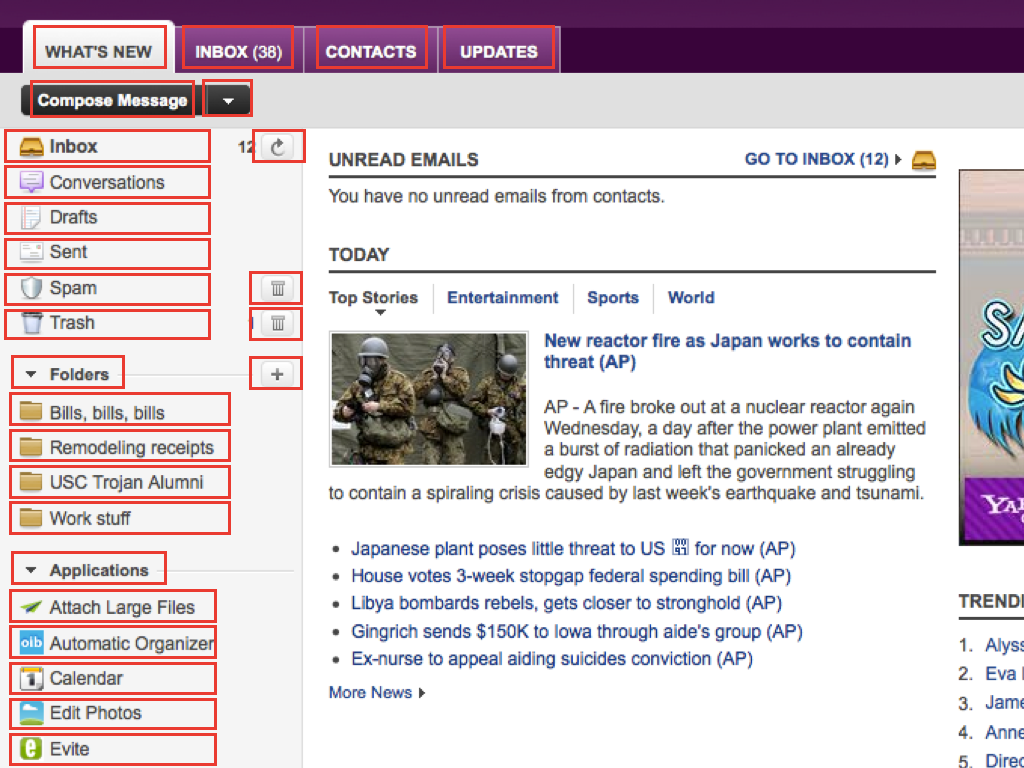
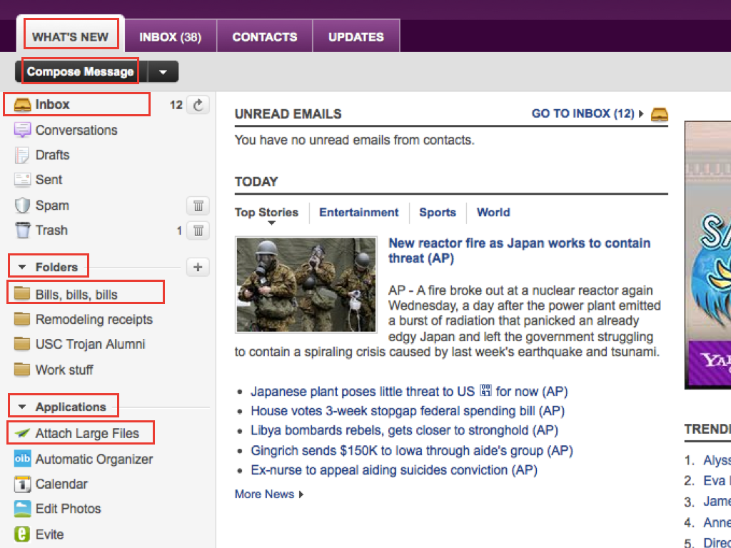
One of the first steps was an audit of the components that we had and how navigation currently worked across them. We looked at the YUI tab view, we looked at our list view (the one that powers the inbox among other things) and we looked at the AOL DHTML style guide which offers up keyboard shortcut recommendations for widgets.
We smoothed out inconsistencies and established a hierarchy of navigation: a page consists of widget containers which consist of controls. This maps well to desktop applications, which was great. The tab key provided navigation between the major widgets. Once within a widget, the arrow keys provided a change in focus, and having the Enter key execute the item in focus. Executing an action means moving the user focus to the result of the action.
- Tab key: navigate between widgets
- Arrow keys: navigate between controls
- Enter key: execute an action
Tab key
In a web page model, a user expects the tab key to navigate between major controls. A user's expectations of what major controls are can differ depending on their browser preferences. Major controls may only be form elements such as text fields and buttons, or it may also include page links. In the case of Mail, we sometimes have to switch "modes". Our header still behaves like a web page. Reading a message still behaves like a web page. You can tab through the major controls while focus is within that "widget".
Once the user reaches the last tab stop within that widget and hits tab again, they're taking to the first tab stop within the next widget. In the case of controls like the tab view, the toolbar or the list view, there is only one tab stop within the widget. Hitting tab again would take the user to the first tab stop in the next widget.
Arrow keys
Navigating within widgets like the tab view require the use of the arrow keys to change focus.
When we were examining the YUI tab view, the arrow keys were changing focus and selection, thereby forcing an action on the control. With Mail, I foresaw a user having multiple tabs open—some which might not have had its contents loaded yet, such as Inbox, Contacts, or Updates. Forcing a user to select and load the content for these tabs just to get to the content they wanted seemed unnecessary.
A concern of ours was where did the user's focus go once a control was acted upon. In almost all cases, acting on a control would move the focus to the result of the action. Clicking on a button to open a dialog would move focus to the dialog. Clicking on a tab would move focus to the contents of that tab. But if selection was changed with arrow keys, do we shift the user to the contents of the window? As you can imagine, it was starting to get confusing and separating focus from selection seemed like the easiest solution.
We use the same pattern of using arrow keys to change focus for the tab bar, the toolbar, the folder list, the message list, and so on. (With exceptions, which I'll get to in a moment.)
Enter key
With a separation of focus and selection in place. A user needs a way to act on a control. Enter the Enter key. Straightforward and predictable. Mostly.
The Message List
The message list was the trickiest because we had various scenarios and the behaviour is a little different than what you might see in a desktop application. In particular, we have checkboxes. Desktop mail software does not have checkboxes. I advocated for removing checkboxes but we actually run into interesting use cases. For example, if you can see that an email is spam, you may want to select the message without actually executing that message as an action.
This is important when you have the preview pane open. Selecting an email would load that message in the preview pane. The checkboxes allow a user to select the message without actually loading the message. It may sound odd but a message essentially had two selection states: selected and really selected.
The other tricky situation is that desktop behaviour has taught us that with focus placed in the message list, hitting the arrow keys will move selection from the current message to the next one. That's right, in this case, we broke our rule by keeping focus and selection linked.
Just like desktop software, we allow for contiguous selection by holding down the shift key while using the arrow keys. You'll notice that all checkboxes in the contigous selection become checked.
Non-contiguous Selection
Todd and I continued our discussions and realized that we could step up our game and offer a really powerful feature: separate focus and selection to allow non-contiguous selection via keyboard.
Using the control key (command on Mac), focus becomes separated. In this mode the space bar toggles selection (the spacebar normally toggles selection on a checkbox). The user can then continue to navigate further down the list to continue their non-contiguous selection.
I'm quite proud of this as we were able to offer up functionality that exceeded was other web and desktop software was capable of. Although, Todd gets much of the credit for working on the actual implementation.
Todd put together a screencast demonstrating the non-contiguous selection using the NVDA screenreader in Firefox.
Augmenting Keyboard Shortcuts
At this point, we've talked about the tab key, the arrow keys, the enter key and sometimes the spacebar. This is the basic framework for navigating the page. We also augment these with specific shortcut keys for specific tasks. Hitting M, for example, will take you to your inbox (think M for Mail).
We need to ensure that we do not conflict with existing browser shortcuts. We established a matrix of known keyboard shortcuts across major browsers, across operating systems and did our best to work around that. Hopefully we did okay.
Importantly, the goal was to ensure that any functionality that was accessible via mouse was accessible via keyboard.
Discoverability
The problem with many of these extra keyboard shortcuts is discoverability. We're still working through ways of educating the user that these shortcuts exist. We've talked about resource pages and help dialogs hope to establish a clear path moving forward.
Some discussion has been around using the question mark (?) as a univeral way of bringing up a contextual help dialog that could list off available keyboard shortcuts.
Evolution
Some of this functionality hasn't yet made its way into the released product but should find it's way there in the weeks ahead. With such a large product, we have plenty to do and will need to continue to audit areas that can be improved with increased keyboard accessibility.
Conversation
You mentioned that you created a matrix of known keyboard shortcuts that have been implemented in browsers, across operating systems.
Would you consider publishing this matrix? I've often considered adding certain keyboard shortcuts to a webapp only to try and remember what shortcuts are already in use by the browser and which ones aren't, then I give up.
@James Asher, I've inquired within the group and, unfortunately, I may have been mistaken. I thought there was a a matrix as co-workers were able to readily indicate which shortcuts were good or bad. Unfortunately, no matrix can be found. Sorry about that.
This page on the WebAim site discusses keyboard accessibility http://webaim.org/techniques/keyboard/accesskey
It also refs a grid (from 2002 admittedly) which shows reserved keystrokes for some browsers and screen readers http://www.wats.ca/show.php?contentid=43
With regards to discoverability of the keyboard shortcuts, perhaps there could a key that you press (and release?), such as the Alt key, and this would cause all of the keyboard shortcuts to appear in tool-tip like pop-ups next to each button/link that has a keyboard. This would be similar to how M$ Office 2007 programs behave. This might not work for all keyboard shortcuts (the ones not related to a specific button/link), but could be a start.
Also, what would be great (although not keyboard related) is to implement a feature similar to one found in Photoshop. You can lock a layer, and if you drag the mouse over other layers, they all become locked. They don't just toggle, they get set to whatever the first layer is set to. If the first layer is set to locked, they all become locked as you drag, if the first layer is set to unlocked, they all become unlocked as you drag. This could be used to select items in the Inbox (ticking/unticking the checkboxes). I did play with this idea a while ago, but had trouble getting it to work cross-browser.
Great article Jonathan! I love seeing real-world case studies like this.
I love the video too. What's in the code that's making NVDA say "click to flag email for followup"? A hidden label on the checkbox?
@Zoe: Good ear! In this case, we have a title attribute on the Star icon at the end for flagging posts. We originally had this as a focusable element. When a user had moved the focus to the current element (using up and down arrows), the user could use left and right arrows to move between columns. We decided to simplify it (since focus styling on a sub-focused element was getting confusing) and left users with L and Shift-L for flagging the selected items. However, we should probably revisit that title text and see how we can improve it for screenreaders. (I already emailed Todd to figure that out!)
Excellent article, thanks very much!