Design Inspiration
There's the old saying, "Good artists copy, great artists steal." I still don't know what the difference is but I steal ideas all the time.
More and more, I've been looking to architecture for inspiration. Buildings, skyscrapers in particular, share characteristics with the common web page. They're built and designed for a vertical space. As a result, many of the design elements that go into architecture can be quite appropriate for site design.
Inspiration for Snook.ca
When I did the redesign of Snook.ca a few months back, I had gone through a number of revisions, none of which seemed to hit the mark.
To give you some backstory , I'm actually a big fan of the Art Deco style. I love hitting up Miami's South Beach and just soaking it all in. When I came across a photo from 1950 of the Waffle Shop in Washington, D.C., I was instantly inspired and felt the need to integrate that style into my work.
There are three particular elements that I took to implement into my design: the wrap, the overlap, and the 3 column grid.
The wrap
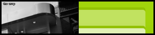
This design element actually appeared in the previous version of the site design but only on the comment box. I decided to take it to a whole new level by using this wrap everywhere. It really helped soften the design and create more visual interest. I tried to implement a lot of "visual motion" into the design. There are the lines behind the logo, the subtle S in the header goes from the tagline ("tips, tricks...") to the navigation, and the dimple accent that appears just below the tagline.
The overlap

The overlap on the Waffle Shop sign is highly pronounced and I tried to come up with a way to accomplish the same thing. The tagline was originally supposed to be entirely uppercase but because it appeared over the line, I didn't have any descenders. So, I switched it to lowercase to at least get the P to cross the line.
The grid
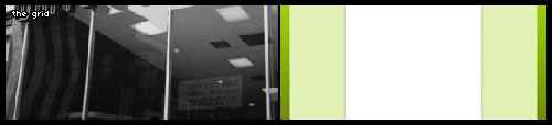
When I was working on the design, I was trying to work within two columns. But the sidebar just never felt right. There was too much information that I felt was relevant and needed some added attention. Noticing the 3 window panes, I decided to go with a 3 column layout.
Don't go overboard
My advice in taking inspiration from other places is to not go overboard. In other words, don't copy it verbatim. This is where people get all uppity. Grab the elements that you like and build it into what you're doing. Take elements from any number of places. Another example where I've done this is the books and speaking engagements listed in the left sidebar. The design approach is the same as Cameron Moll's (see books in right sidebar).
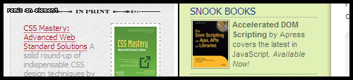
There is an image with a border with some text beside it. I changed the style to fit my site but it's still the same basic approach.
All the gallery sites and Flickr inspiration groups are great, and you can definitely find some great design elements but take some time to get walk around and see how other things are designed. Architecture, magazines, books, and signage are just a few good places to find some design inspiration.
For more information on the Waffle Shop and Art Deco check out:
- Waffle Shop: 1950 a vintage photo of the restaurant
- Fast-Order Classic from the Washington Post
- Streamline Moderne is a branch of the Art Deco style
Conversation
I'm also one to find visual inspiration from architecture. I've got an element similar to the "wrap" you used in your design that I use on my site. My inspiration came from the awnings over the windows on a house across the street from me.
just a comment to let you know we arn't ignoring you!
great post - thanks :)
I always find it interesting to see where people get their inspiration from ;)
I like it. I like it a lot. I'm now going to find all the photos in my house and look at them all.
I have loved this design since it's opening and thought it looked like a mini-jukebox music menu from a 50's diner. The sort of mini-jukebox that would be found on each table...great work.
Leave it to you to turn a Waffle House from 50 years ago into a beautiful website design... I bow before the master. :P
Very nice. Great to see offline web design inspiration. I've been a fan of your design for a long time as well.
I get inspiration from advertising in any form, leaflets, giant ads on the street etcetera.
And other websites, but not architecture.
For your site I really enjoy the subtle shadows and the comments area. I like how it is separated out and 3dish. It really takes the site to a different level.
One of the best features in your site, is a definitive footer. Sites that just end, are awkward for the user, as you don't know if you have returned all results/data from the server. The padding is important too, because it visually shows there is nothing more, and also helps move the content the user cares about (e.g. the final thing) up towards the middle of their view.
As for the Art Deco thing, yeah, South Beach Miami is quite something... you just can't be grumpy there.
I've often visited your site and wondered how someone, anyone, could come up with such a great design for such a common technology (blog). It's nice to know where your inspiration came from.
It's harder for me to look at building architecture and see how to incorporate that into design. I guess, perhaps, it takes some practice or I'm just not creative enough. Nevertheless, inspirations is EVERYWHERE.
Greetings Jonathan;
I used to be a constant reader of your blog, but work and moving has slowed that down. While looking towards the net for a new avenue to apply some new techniques I am learning, I came again across your site and specifically how you would explain this design.
Its impressive. Not just because of how you've integrated the various archecture elements, but in how you personalized it in the process. I came to your site and recognized it as yours despite not having been here in a long time. And at the same time the look is refreshing. Thanks for doing a design that takes a chance, and at the same time is already accepted for its consistancy.
Good to see some inspiration from a source besides other websites. I believe that most of the time as web designers we just focus on the web for inspiration, which can get boring really quick.
Well, good eyes may bring tons of inspiration. But, some use that inspiration only for craps. You use them in the good way. God Bless You!
Hey. You can't just ask customers what they want and then try to give that to them. By the time you get it built, they'll want something new.
I am from Japan and learning to read in English, give please true I wrote the following sentence: "The twists and turns of sentences, the difficulty of finding just the right words—we all could use."
Best regards 8), Perfecta.