Behind the Process: Snitter Icon
I built this desktop application a while back called Snitter. It's a desktop Twitter client that runs on Adobe AIR. Alas, it fell by the wayside during my freelance tenure. Recently, I've had the inclination to start working on it again and bringing forth to reality ideas that I've had for over a year now.
 One of the things that always bothered me was the rather rushed icon. A rather boring S. I was just happy that I had a desktop app with its own icon. I knew I'd get around to getting a new, more polished icon at some point.
Who can? A Toucan.
Being a Twitter app, I wanted to stick with the bird motif but also wanted a bird that had some colour to it — especially green. The toucan came to mind, as images of Toucan Sam and his colourful beak filled my head.
In doing research on toucans, I came across a page on Toucan totems.
The toucan represents communication and showmanship. The toucan's colorful appearance and large bill indicates a strong desire to be seen and heard.
If anything sounded more appropriate for a Twitter app, I haven't heard it. The toucan was now the bird.
Initial Sketches
I'm not an icon designer, so I enlisted the help of Mike Rohde. The fact that he said yes to a free project was music to my ears. I gave him some simple direction that I wanted the icon to be a toucan and he came back with some initial sketches.
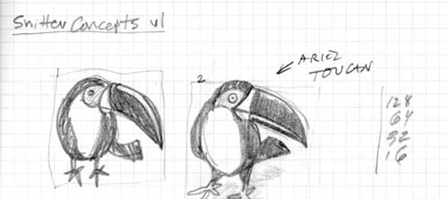
I was definitely starting to get excited. I had started to provide Mike with some further direction, indicating that I really liked the bird looking over the shoulder. I felt it provided more balance and would be easier to work into an icon.
Alas, a year had gone by and my ability to work on Snitter had disappeared. Sadly, so had Mike's free time. Mike had to bow out. Having been in his shoes, I completely understood.
Inspiration
Now on my own, I thought I'd give icon design a try.
One thing I did differently than any other design project I've done before was to create an inspiration document where I threw in a bunch of photos and icons that I liked.
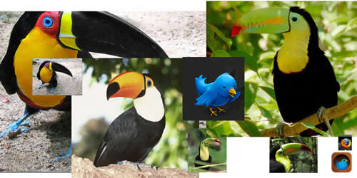
When you see the final icon, I'm sure you'll see where much of the inspiration has come. I started by actually tracing out the shape of one of the birds that was looking over his shoulder. Using the pen tool in Fireworks, I traced out the beak, the head, the chest and the body. The shapes had flat colours and I really just wanted to get the basics of the shape in place.
Circle-bound
Two things that I was missing were a tail and feet. As I started to put the tail in, I begun to see the circle shape come into play. I drew a circle and placed it behind my vectors and tried to lock everything into that shape. I was drawn to using the circle based on the Twtterrific and Firefox logos. (I was tempted to have my bird circle a globe but thought against it.) This is definitely where the most progress was made.
 I had a tail in place and then started on shading. I layered vectors over top of what was there, playing with gradients and colours to create the effect that I wanted. It was after this point where I really started liking how things were coming together.
When I posted this version to Flickr, a few people mentioned its similarity to the Aviary Toucan. They did a fantastic job with that toucan. One thing that was extremely evident was how tightly they stuck to a circle for the beak, head and into the body and then breaking out of that with the wings.
I took that inspiration and went back to tweaking my toucan. I still didn't want to stick too close to the circle but I did lengthen the beak, having it follow the edge of the circle, instead of having a more defined hook nose. Where the beak meets the head, I decided to leave it as-is. I didn't want to stylize the bird too much.
Stay on the ground or fly?
I still had no feet and I wasn't really loving the wings. Trying to play with the circle, I tried to get the wings to complete the left side of the circle but everything I tried felt unbalanced, leaving a large space right in the middle of the logo.
Starting to grow weary of using the pen tool to shape things, I switched to use circles to punch shapes into crescents for the wings. It was at this point that I used a circle to punch the shape of the toucan's back. I liked it.
When I rotated the crescents I had, I tried shifting them into the middle of the space between the head and the body. The crescents were so large that they inadvertently popped out on the other side of the bird. Wait, it looks like wings on the other side! This happy accident got me exactly what I wanted.
With the bird in flight, I no longer had to worry about the feet. I tried a couple different things earlier to get feet but they all looked hideous. Feet are not my forté, it seems. No worries, as I was really happy with how things were shaping up. (a little vector humour there...)
I continued to adjust the shadows, adding highlights to the bottom and the wings to give the bird a little more depth. Finally, I was happy with the result. Like, really happy.
Let it fly!
This will be the icon for the next version of Snitter, which I'm hoping to have out in a couple weeks.
![]()
As an added bonus, I'm linking up the final Fireworks PNG. Download it and check out how it's all put together. The design is copyright so don't go throwing toucans over everything but pick it apart and use it to inspire your next design. The Fireworks file was created in CS4 and uses the Pages feature where I have an earlier version on page 1 and then the final version on page 2 (a cheap way to do versioning).
Conversation
Love the illustration, but not digging the type. Looks to hot dog-ish. Maybe go with something more geometric or circle ish - such as the typeface Duoh uses: http://www.duoh.com/ which i think is chalet paris
I love the illustration as well. I do somewhat agree about the type, and tho I DO like the current choice, seeing a variety would for sure be pretty cool as well.
I like the direction that this is headed, what are more of your future plans for "Snitter"? Just curious.
I look forward to hearing about it.
Nice work Jonathan, thank you for sharing the process.
I love Toucans, they are very graceful creatures, which btw are great "jumpers", almost to the point that you may think the prefer to jump (like kangaroos) rather than fly.
Here in Ecuador, they are very loved birds, and thank to their colorful body, they are widely used in publicity.
Nice work with the logo! I'll try your app.
Personally I prefer the first one over the flying one.
And I don't think it should have feet.
@Niki and Nick, the font is VAG Rounded and is the font that's currently in use on the Snitter home page. Basically, I stuck with the same but I like it because it carries the same feel as the Twitter logo, which is plenty rounded.
Multi-talented anyone? Great work! Love the end result.
the bird looks great!
I've with Andy, I like the first version of the icon much more, but still nice work :D
The logo came out great. I have tried to do some logo design myself a few times and I am absolutely terrible at it. It is usually because I lack some sort of centralized figure. Thanks for the breakdown, I'll be sure to remember some of these points next time I try my own icon.
That is true,
I didn't say I disagreed with your font choice, I do see the similarity. I was just wondering what else you could come up with in this new branding adventure you are taking.
Looks amazing, I have to say I am also with Andy and Jack. Nice work!!!
Andy.
Love the icon and thanks for sharing the steps you went through to come up with the end result.
On a side-note, I'd like to see what the icon looks like against a lighter background. The dark grays are so similar that the Toucan seems to blend in more rather than pop off the page.
Thanks for sharing!
I like the 1st version more, don't like the wings, they look forced into the circle. By the way, it's also too 'circlish', ain't it? break the trend!
Also I don't like the type; too standard, nowadays everybody's doing the same thing... pour some wild imagination.
No mean to offend.
Dude, I have to say I love the toucan. Both versions are awesome, but I would have to agree that the flying is the coolest, I like the wings.
Like Aaron, I'm curious to see it on a lighter background!
If you're interested in checking out what it'd look like on a light background, check out Flickr.
@Alex: It is circlish but hardly a trend. At least, not these days. Looking at my Dock, almost all the icons are square. Only the Firefox and Twitterrific logos break the trend. I do want something to stand out and I think what I've got now will do just that. The typography will almost never be seen so I'm less concerned about it.
Jonathan, this is a fabulous process to share with everyone.
I'm glad to have played a small part in the process (very small) and I think things working out for you to do the icon yourself was a blessing in disguise — great work!
I'm a huge Fireworks fan as well, building all of my icons using vectors in Fireworks. I do very similar things as you during the process, including the inspiration document you mention. It's very handy to have all of the elements ready for a quick reference.
Can't wait to check out your PNG file to see how the vectors, layers and pages are structured.
Great work, thank you for sharing the process,i really like it.Both versions are awesome, but I would have to agree that the flying is the coolest.
It's great!
I'm not sure about the angle of the wings, and perhaps the tail might have a split or two, but the rest of it looks pretty good.
Oh, and I just noticed that the wings look like they split in two halfway down. I'd make the lines between them less pronounced (and move them closer), and maybe add a third crescent. Or maybe keep it at two.
The icon looks beautiful!
This where the creativity lies a lot. The small start of play has got huge attraction. I really love the way it was being created. The pencil sketches are really awesome.....
great window into your creative process, thanks for sharing!
web designers can design, not only graphic designers...
Nice work! I think this might end up on some sports teams helmet!
I used it but having problem to logo design.I have tried to do some logo design myself a few times and I am absolutely terrible at it. It is usually because I lack some sort of centralized figure.
The icon looks beautiful! :)
Very nice, but a little too new looking!
I love the look of this illustration and would like to use it when your done. Thanks for the hard work, connie
I was looking for an Icon Tutorial. Thanks.
The final result looks great, little humor as well as giving a clear detail of the product... hope nobody confuses that n for an h???
Really nice work, although I much prefer the first circle bound one, I think that the circle gives it a really nice style. I had waaaaay too much free time this evening & put together my own take on it. I think that there was an opportunity to shape the bird into the letter 's', anyway you can see my version here http://tinyurl.com/illworks