Stackable CSS Columns
Source order is fairly important for me. I like to make sure the the order makes sense and is practical. For a recent project, I ended up using something quite handy. Something I like to call Stackable Columns.
The basic layout had a left column with the logo and some sidebar information and then a right column with some main navigation, content, and a footer. A two column layout is standard fare these days and I'm sure most would probably just float the two columns. Unfortunately, just floating the two columns as-is would have the source order as Logo, Sidebar, Navigation, Content, Footer. What I needed to do was drop the sidebar down in between the content and the footer.
To pull off the content shuffle, I organized my HTML into 4 containers, (1) is my logo, (2) is my navigation and content, (3) is my sidebar and (4) is my footer. Without applying any CSS, we basically get what is represented in diagram A.
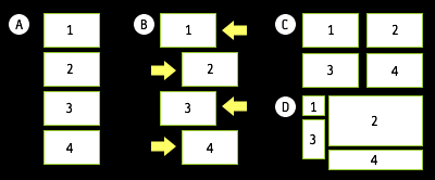
Next, I float (1) and (3) to the left, and float (2) and (4) to the right (diagram B). This leaves us a layout grid somewhat like diagram C but with the design for this site it actually ends up looking like diagram D, which is exactly what I wanted.
The client, Lodestone, is still in the midst of populating the templates but in the meantime, you can check out the template (along with the inside page).
Conversation
you could achive this with negative margins too.
I'm unsure of how negative margins could have accomplished the same thing. Could you expand on that?
Looks good. I would be interested to see how negative margins could create the same effect.
So, you are using opposing floats to get the job done - and the content will fill in the rest. Is that correct?
Negative margins could reproduce the same effects if you were to just stay in one browser, but when you try to create a cross browser experience, you tend to fall short.
People talk about the big differences in IE and Firefox, and this is one of the bigger things. IE is extremely different in handling margins, and so floating is actually the better solution.
I tried to figure out what Dr Dreaded was talking about, and I couldn't seem to do it using negative margins. I was able to do it using absolute positioning for the sidebar, though.
I like Jonathan's better as you can achieve it using only floats, but just for the sake of education it's nice to see other ways things can be done.
#5:
This'll get you almost there. IE has a problem with #box4 though:
I can't remember seeing this method used before. It's too simple. The style sheet is simple, too. And, the site's HTML 4/Strict.
Does Lodestone appreciate these things?
Nate K: Yes, opposing floats gets the job done. In the diagram, box 3 has the main content. One thing is that box 3 has to have more content than box 1 or box 2 will end up under 3. In my case, it was a given but something to consider.
Sean Fraser: Thanks for noticing. :) I was pleased at how well this came together. Only one IE6 hack in the entire design (I used zoom:1 to contain the floats in the content area). The client was definitely appreciative.
Nice solution.
What I don't like about floated sidebars though is that it's difficult to achieve liquid layouts that way (both content and sidebar should have to scale horizontally, which generally doesn't look good for sidebars). For that reason I tend to use absolutely positioned sidebars and the content DIV has enough left or right margins to leave room for the sidebars, while keeping the right source order.
May I know how does zoom:1 work?
Lim: that is my secret ingredient! :) Basically, it's used to give a container 'hasLayout' which behaves differently than a regular container. A search for 'hasLayout' should bring additional insight to it.
Nice work Jonathan. Would having the columns in this specific order be better for SEO purposes or accessibility? Or do you just prefer them in that order for no other reason?
fixed size sidebar + liquid main content, using some neg margins ... seems to be working (Win : FF 1.5, IE6, IE5.5, IE7 beta 3, Opera 8.54, Opera 9.0) :
body { padding: 0 0 0 200px; }
#container { float: left; width: 100%; }
#logo { float: left; margin: 0 0 0 -200px; background: lime; height: 75px; width: 200px; position: relative; z-index: 2;}
#main { float: left; width: 100%; background: #ffc; height: 500px; }
#sidebar { float: right; margin: 75px 0 0 -100%; position: relative; left: -200px; background: pink; height: 600px; width: 200px; }
#container>#sidebar { left: -100%; }
#footer { float: left; width: 100%; background: silver; height: 50px; }
actually buggy on IE7
Ben: Some have indicated that source order is beneficial for both of the reasons that you mention. The client specifically felt that source order was important to maximize SEO. I do it on my own site for the same reasons and with Google my #1 referrer, it seems to have been effective.
From an accessibility point of view, those with screen readers would certainly have fewer links to wade through to get to the main content, which I know could be solved with skip links but I've never been able to integrate them well into a design and source order minimizes the impact.
Nice clean code. I haven't had a site that I could use this on yet.
I keep designing sites, that need extra wrapper divs for the background images. Some day....
Here you go:
http://www.brunildo.org/test/twocols.html
You need extra markup for IE but hey:
I loved the article. It's great that you keep these short. Fortunately I already knew this technique, but I have to say I was even more amazed at your work. Excellent job. You nailed that design. They should love it.
negative margins is used as a last resort. floating makes more sense and while xhtml should be so god damn semantic CSS should aswell.
I just figured out how to make a dynamically height + widthed 3 column page.
It's ALL ABOUT ORDER!!!
:)
Yes, the ORDER really matters
I have been trying to accomplish something similar. Thanks for the know-how (also, love your static comment block here - really amazing work you do!)
Really awesome article. I've only been studying CSS now for about 3 months and must say it's truely a fantastic language. I love everything I see and for the most part, it's very intuitive on how it's all set up.I've built my fisrt 100% tableless site and look forward thanks to you to doing some more advanced things in css in the near future. I can't wait until CSS 3 will be more of a standard as well. Keep up the awesome work!
Very interesting article Jonathan, I say only it live CSS Design. Thank you for the helpful info.
Here's a site with 40 or so layouts that use negative margins to get the content in first..
http://blog.html.it/layoutgala/
I probably came across this when I was a novice and got confused, but now I know source order does matter.
An interesting example showcasing arrangement of CSS boxes is the redesigned Apple.com website. I'm not sure whether it consitutes as 'stackable' or not, but taking a look at the html and css reveals an easier to understand framework compared to that of Yahoo.
What Apple.com seems to have done is to use classes to create the 'stacks', but to then apply an id to those divs with a more relevant nameto what the div contains.
Interesting article Jonathan. It's important to read and learn from a guy like you! thanks for sharing this.
we did the same thing at obuweb.com. The left column with logo and nav loads after the main body. This is also important for SEO. Float right is your friend