Further discussion can be found on the blog.
The idea behind this melds table-based layout concepts with a pseudo-absolute positioning system. The core of this is to allow elements to be positioned within a positioned container (absolute, relative, fixed, or matrix).
This document is split up into three sections:
All examples that follow assume a basic HTML structure like the following:
<div id="container">
	<div id="a"></div>
	<div id="b"></div>
	<div id="c"></div>
	<div id="d"></div>
</div>
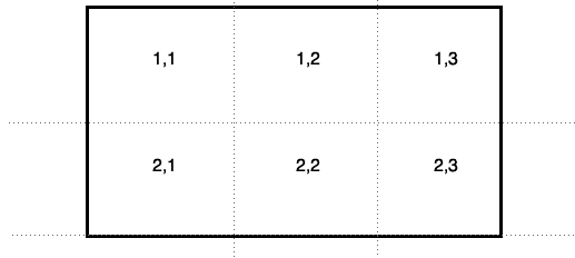
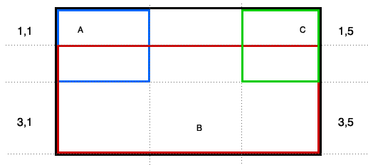
Matrix positioning uses a pair of row and column coordinates to determine the size of a grid. The first pair defines the top left quadrant and the second pair defines the bottom right quadrant.
position: matrix(row,column, row,column);
#container { position: relative; }
#b { position: matrix(1,1); }
#c { position: matrix(2,1, 4,6); }
When an element is positioned using the matrix syntax, it defines a grid within the positioned parent. The default grid contains one row and one column. Specifying larger numbers pushes the boundries of the defined grid. New elements can be laid within the existing grid or increase the boundries of the grid with larger matrices. When the second pair of matrices is ommitted, the first pair will be repeated — essentially locking the element to a single 'cell'.
#b { position: matrix(1,6); } /* is the same as... */
#b { position: matrix(1,6, 1,6) };
The parent element will expand to encapsulate all elements within the grid. A height can be independently supplied to the parent element. If it's less than the height of the contents then normal overflow rules apply. If the height of the parent element exceeds the height of the contents then the last row will expand in height to the border of the parent element.
Any sibling elements within the container that are not using matrix positioning will continue to flow as normal. Where a mix of static, relative and matrix positioned content exists within a parent element, the parent element height will expand to contain the content.
The matrices represent squares on the grid:
Positions can be specified as wildcards, allowing an element to automatically stretch along a particular row or column as a grid expands.
The following example would have an element stretch across the entire first row.
#b { position: matrix(1,*); }
The following example would have an element start at the 3rd column and continue until the end.
#b { position: matrix(1,3, 1,*); }
You can also use the wildcard in the first X/Y coordinate, but it would be the same as specifying 1 as the value.
#b { position: matrix(*,1, 6,1); } /* is the same as... */
#b { position: matrix(1,1, 6,1); }
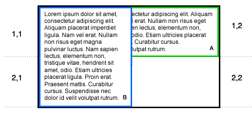
#a { position: matrix(1,1); }
#b { position: matrix(2,1); }
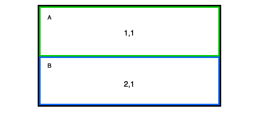
Boxes A and B would stack, automatically stretching to the width and height of the positioned parent. Where the content within the positioned elements does not fill the container, the height of that row will collapse to the height of that content. The last grid row will take the remaining space.
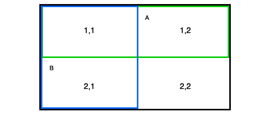
#a { position: matrix(1,1, 1,2); }
#b { position: matrix(1,1, 2,1); width:50%; }
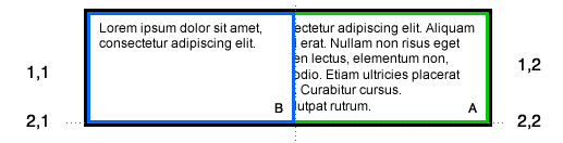
Even though container B is specified to span two grid rows, there is not enough content to expand into that grid, therefore collapsing that grid row. The width keeps the first grid column at 50%, leaving the remainder for the other grid columns. As container B gets more content, it'll expand into row 2, pushing the height of the column up.
Boxes A and B would stack, automatically stretching to the width and height of the positioned parent. Where the content within the matrix positioned elements does not fill the container, the height of each element would be a percentage of the positioned parent height. The percentage would be determined using the same model as table cells.
Overlapping elements follow the same z-index rules as absolutely positioned elements.
#a { position: matrix(1,1, 1,2); height:50%; }
#b { position: matrix(1,1, 2,1); width:50%; }
Specifying height and width avoids collapsing grid columns or rows.
#a { position: matrix(1,1); }
#b { position: matrix(2,2); }
#c { position: matrix(1,3); }
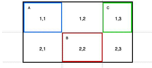
The short form defines how content can quickly be placed at a point within the grid.
#a { position: matrix(1,1, 2,2); }
#b { position: matrix(2,2, 3,4); }
#c { position: matrix(1,4, 2,5); }
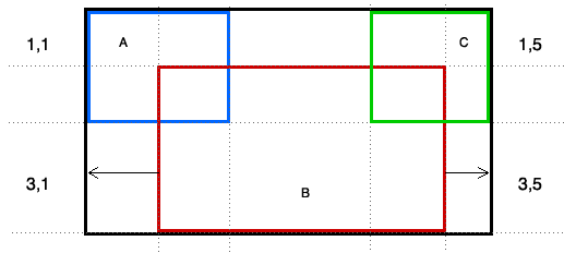
In this case, columns 1 and 5 do not have any isolated content, since boxes A and C stretch over multiple rows and columns. Columns 1 and 5 will collapse.
The normal z-index would have element C appear over element B because it appears lower in the source order. Like absolute positioning, a z-index can be applied to have an element layered over another.
#a { position: matrix(1,1, 2,2); }
#b { position: matrix(2,2, 3,4); }
#c { position: matrix(1,4, 2,5); }
#d { position: matrix(3,1); }
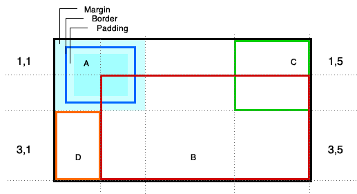
In this case, having an element with content placed into the first column expands that column while column 5 remains collapsed.
This example also demonstrates how margin, border and padding are contained within the grid square.
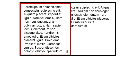
#a { position: static; }
#b { position: matrix(1,1); width:50%; }
Here are common design scenarios and how they can be achieved using the matrix layout approach:
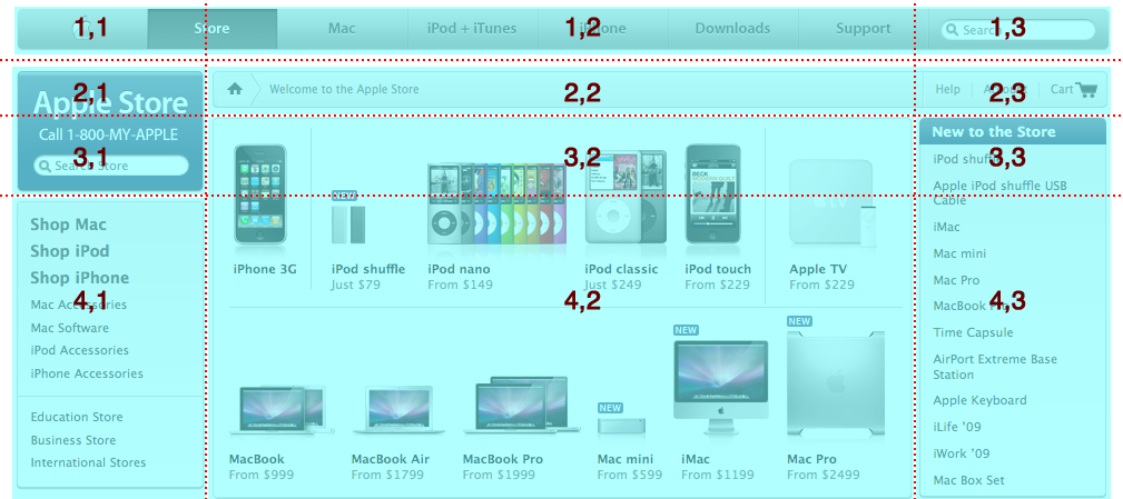
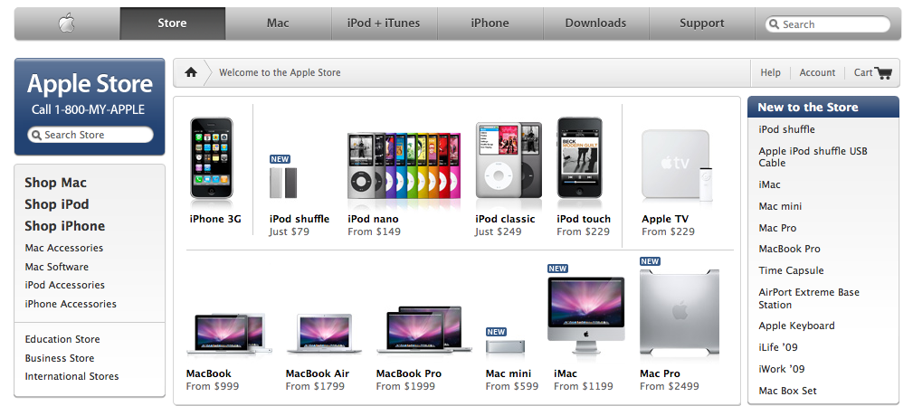
The Apple Store presents a fine example of how matrix layout may work.
In the next diagram, the sections of the grid are overlayed to present where the various content currently appears.
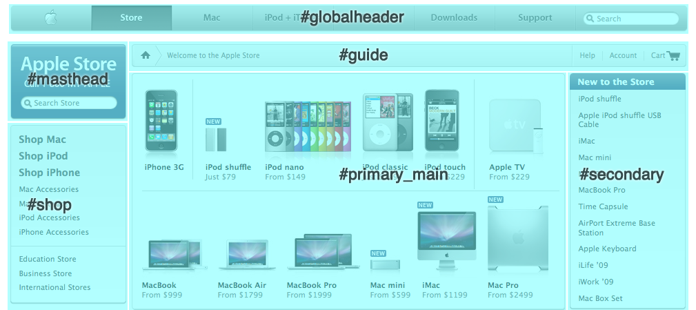
Currently, the site uses various levels of DIVs to pull off the complex layout. Using matrix layout, a more simplistic HTML structure could include:
<div id="container">
	<div id="globalheader"></div>
	<div id="guide"></div>
	<div id="masthead"></div>
	<div id="primary_main"></div>
	<div id="secondary"></div>
	<div id="shop"></div>
</body>
The order of the elements places primary wayfinding elements first (globalheader, guide and masthead), followed by main content (primary_main), followed by secondary navigation (secondary and shop).
The CSS could be as follows:
#container     { position: relative; width: 980px; margin: auto; }
#globalheader  { position: matrix(1,*); }
#guide         { position: matrix(2,2, 2,3); width: 800px; margin-left: 5px; }
#masthead      { position: matrix(2,1, 3,1); width: 170px; margin-right: 5px; }
#primary_main  { position: matrix(3,2, 4,2); width: 630px; margin-left: 5px; }
#secondary     { position: matrix(3,3, 4,3); width: 165px; margin-left: 5px; }
#shop          { position: matrix(4,1); }