Matrix Layouts
This post isn't about what you think. This isn't about some handy little CSS technique you can implement right now. Not yet, anyway. This is about an idea that I've been working on. An idea that — I hope — will one day help you and me build better web sites.
I've come up with my own layout specification.
Um, why?
Who in their right mind would ever want to do something like that? Apparently, I would. Here's the thing. Some people compain and don't offer solutions. Layout with CSS does have its drawbacks. I've gone through table-based layouts. I do float and position-based layouts. I understand the limitations that exist and I've lived them. Rarely do I complain about it.
Would I like something better? Yes. I'm not going to complain about it, though. This is my offer of a solution. Eric Meyer wants a layout system and I'm going to try and give him one (and the rest of us can enjoy it, too).
Don't we already have layout approaches in the works at the W3C?
Yes. We have Template (aka Advanced) Layout and the Grid Positioning Module. I feel that the former is too complex and the latter under-defined (and so is mine, but we'll ignore that for the moment).
Coming up with a layout, considering the constraints of plugging this approach into existing systems, isn't easy. It's been almost a month since Meyer's missive (which is what inspired this whole crazy idea). Whenever I had a few moments (driving, right before sleep, sitting on the toilet), I'd try and think of how this could work. It's surprisingly hard. Every now and then I'd think I'd have an idea. I'd consider how inheritence would work, how it would work with other positioning systems, and the idea would break down.
Then, inspiration struck. I spent an hour that night writing my idea down. I talked about it to a couple people. Nobody understood. I did up a first draft "spec" and people sort of got it but were still heavily confused. I revised it some more and added a use case. Now it started to click for people. (In other words, they weren't completely disgusted by the idea.) Maybe it's ready to share to a larger audience.
So, what are Matrix Layouts?
Matrix Layouts are like table-based layouts combined with absolute positioning. It only adds one new property value and tries to build on existing concepts (margin, border, padding, z-index and all that other fun stuff still works the same). Will it be the perfect solution for all your templating needs? No. I already see areas where it's less than ideal. But it'd be better than what we have now.
Here's how it essentially works (in a nutshell): You use the position property to specify where the box should be placed within the grid. Let's look at the following example diagram.
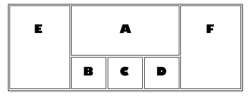
It's a 3 column design but with a little extra pizzazz in the middle column. I've also lettered each section by their source order. Now, let's look at what that code would look like with matrix layouts:
#a { position: matrix(1,2, 1,4); }
#b { position: matrix(2,2); }
#c { position: matrix(2,3); }
#d { position: matrix(2,4); }
#e { position: matrix(1,1, 2,1); }
#f { position: matrix(1,5, 2,5); }
The container is essentially broken down into a grid of rows and columns, the number of which are defined by the highest number of rows and columns defined by any element within that container. The matrix value takes up to 2 pairs of numbers. The first pair is the top left and the second pair is the bottom right. If the second pair is ommitted then it just uses the first pair. (In other words, it would only use one square in the grid.)
If you've seen the Advanced Layout draft, you'll probably see some small similarities. It's not as powerful as Advanced Layout but hopefully this simplicity offers it the chance to get implemented sooner rather than later. This sort of looks like table-based layouts but with independent source order (and a couple other bonuses that aren't covered in this little example).
Work in Progress
It is definitely a work in progress. And this will continue to evolve; mostly to help explain how I envision it. I can see it in my head but may not have expressed it well.
There are definitely some grey areas. Right off the bat, I can think of a couple things that need clarification. How should negative margins be handled? I'm not sure. What should the heights and widths of a box be if the numbers don't add up? I'd suspect more like tables but I don't know the mathematics behind this for current browsers to document this for my spec.
The Goal
Ultimately, I want browser developers to integrate Matrix Layouts into the next version of their browsers. I bring this solution forward in hopes of spreading word, getting feedback, and building momentum.
Let's do this thing.
Leave a Comment
As always, I love feedback but at this stage, I'm specifically looking for constructive criticism. Tell me what won't work or what might work better. If you have any questions, please ask.
If you haven't already, go read the Matrix Layout proposal.
Conversation
I love this — it feels like it combines all the things we love about positioning, while allowing some of the flexibility that folks miss from the table-layout days, but does it in a way that should make sense even to print designers (since I am one, I can say that ;)
The key is, I'd love to play with it *now* — which I can't say for any of the existing ideas/proposals I've seen tossed around over the years. So the question is, are the browser makers and the W3C listening?
So would these content areas exhibit table cell behavior within the container matrix? Ie: cells b-f have background images, and cell b extends the furthest vertically in the browser. Cells c-f then extend to match that height? If so, that would be great for some layouts but would be an issue for others (ones that would want the opposite behavior currently inherent in floated elements).
I'll definitely keep an eye on what you're doing. I'd love to be able to vertically align certain content blocks easier, and this looks like it would be a solution.
@Dan Rubin: I'm probably going to post a message to www-style to see if I can get some response from them. I worry about the response but we'll see.
@Shane: the elements extend to the bottom of their square. In the example you gave, the background for cell B would extend to the very bottom of the container, as would those for cells C through F. If B has too much content, it will increase the heights of the other columns (just like table-based layouts).
It looks like the advanced layout module but without the horrible syntax of making grids in ASCII (that's a compliment by the way)
I'm just thinking how annoying the syntax might be if you need to add a section in dynamically, or how if you've got a slightly different template on one page (i.e. add a row), you have to re-write the entire grid.
I think it's got potential, but maybe putting more editorial work on the grid layout module to incorporate your ideas would be more beneficial (maybe I should have a go!)
twitter.com/steveworkman
Maybe I missed this part, but how do you specify how large each individual grid unit is going to be?
Above, #a takes up 6 grid units. How do I say globally that I want each unit to be 4em x 2em, or maybe 60px by 90px?
I like it.
Interesting idea. One thing in particular I like about this solution is the grid layout is not in anyway dependent on the order of the elements in the HTML markup. So, I can order my elements based on importance and style them in any sort of layout I want without hack after hack.
I like the concept and for this example it totally makes sense.
I'm wondering though, how this works for more complex layouts. Would there be such thing as "nested matrices?" Not that that's necessarily a good idea, but what happens when you create a complex layout and then, sometime in the future, you need to sub-divide a container into multiple containers?
Does the whole matrix need to be rewritten? Or would it just be recommeded to start with a large enough matrix to accomodate future changes? (similar to designing for a 12- or 16-column grid system)
@Steve Workman: I did consider that and yes, shifting things around in the matrix would be a minor hassle. I say minor because if you use table-based layouts, it's even worse. And because changing the matrix values on 8 properties would be okay for me; especially since it doesn't happen very often.
This is one of those areas where Advanced Layout is better. I have no issue admitting that. :) But I do want to keep this simple enough to be implemented as soon as possible.
And yes, have a go at improving the grid layout module. Let's get something that browser developers are excited to implement sooner rather than later.
@Zach Leatherman: specify like you would now: ems, px, %. Whatever you want.
@Dan: Yes, you can do nested matrices. Just like you can position absolute in relation to parent absolutes or relatives. (and you can use position absolute/relative within, as well). It's one of the primary reasons I chose it as a value of the position property. It retains the concept that once an element is positioned (ie: not static), it can use different positioning schemes within it.
I like where this is going. My only complaint thus far is the syntax within the
matrix()call when specifying both pairs. Using a comma to delineate the row and column, in addition to the two row/column pairs, seems awkward.As there will only be two pairs at most within a
matrix()call, why not use a dash between the two?That way it would also sound more natural when read aloud: "position as matrix from 1,2 to 1,4". Just my two cents.
I like it as a means of deciding where in a grid/matrix an element should go, but I think it would benefit from cocoa-esque layout masks properties to define in clear terms how each row and column behaves. I'd also consider a notation for the rows/columns that's a little clearer:
#a {
position: matrix(1,2-4);
}
which could be the equivalent of your example.
@Andrew/Matt: the syntax was done to somewhat mimic how margin and padding shortforms work. In fact, if I had to take any direction, I'd remove commas altogether. like so:
The reason I didn't was because I felt the commas helped with association. But if everything else looks good, I'm cool with whatever separators. :)
It's an interesting idea for sure. Don't see why it wouldn't work. I'll be interested in keeping an eye on this to see how it develops. Don't have any ideas yet, but if I do I'll be sure to share them.
Good work Jonathan!
I've been pretty successful assembling various grids dynamically using YUI Grids CSS. It takes a little bit to get used to, but so does this. How would a matrix like this differ from using a CSS positioned DIV solution like YUI Grids?
@Dan Sorensen: there's two main limitations of current grid systems:
1. You generally have to create deeper div structures to pull off certain grids and have tighter source dependence to rely on. Looser than tables but tighter than Matrix layouts.
2. You can't apply backgrounds that stretch to the height of the container. You have to fake it by applying the background to the parent.
Actually the more I look at it, I think I'd prefer the rows and columns to be grouped, with the comma's only use being to separate rows from columns. Inspired by Andrew's comment:
I like the concept, but I fear the downfall lies in the changing of modules in the the center (in your example). Many of times people will want to add/subtract another row and/or column. This seems like it would require you to update all elements because the matrix #'s have changed.
Dude, I thought this was going to involve Bullet Time somehow... :)
@Jake: There is some flexibility in the spec (if you've had a chance to read it) for specifying something like "take an entire column, no matter how many rows". Therefore, adding additional rows to the middle column wouldn't be an issue.
If we wait for the perfect solution, we could be waiting awhile.
I think this is a concept that makes a lot more sense than other ideas I've seen floated (pun intended) around. Lots of questions as expected, but I think it's a simple, clean solution that could be implemented pretty quickly.
Jonathan...I apologize for not thoroughly reading the spec.
Is this a proposal for inclusion in like a CSS4?
Do you think it would be possible for someone to actually implement this with JavaScript so we can actually use it this decade?
I also really like the idea of using standard shorthand
But I think it might make more sense if matrix() was the short-hand, and long-hand versions existed:
At first I wanted to complain about the lack of an initial column and row value (specifying a 3x9 matrix, for example), but after reading through the spec, I really like the flexibility provided by determining the matrix dynamically.
This seems incredibly simple, easy to use, and it looks like it could potentially solve a lot of layout issues.
I think you've got a winner here. If you need beta testers, I'm all for trying this out.
Interesting idea, however, I think I'll be quite content with the CSS layout tables in CSS3.
I love this - really like Jason's idea for the shorthand/longhand variations of this. By having a longhand version it makes it easier to condense in your head what the shorthand is.
i.e. knowing about "border-top", "border-right", etc in my head makes it easier to remember the shorthand because I'm memorizing the order of a list of rules in order to be more efficient, rather than memorizing what each number in a rule stands for.
Seems like a small difference but I think it's actually an important distinction between the two.
I like your idea a lot, but... what' s the problem with display: table?
I think this is a great idea! Compared to css table layouts, a matrix on which to base our layouts makes so much more semantic sense. In regards to semantics, using tables in a style sheet is hardly any better than using table markup.
You got my vote on matrix layouts; I'm interested for more!
@Martin Bavio
The main problem with tables are that they ties your document order to the layout (left columns have to come before right and top before bottom regardless of what makes more semantic sense) and that they don't allow overlapping boxes (something which this approach specifically addresses).
@Andrew
I see, so this approach seems a lot more flexible. I would like to know how to do this and not to attach to fixed box sizes. But, maybe that's not important, once the general idea is done, transform it to relative sizes should not be a problem.
Ok, you got me, Snook. I will keep here waiting for more!
I like it more than the ASCII grid and I think it may just be easy enough to catch on. At the very least, I'd like to see more thought on it. I read the spec. Keep up the good work :)
The big problem with this and the other cards on the table is - how long is it going to be until we can actually use these new-fangled layout modules. If someone opens a site up using your matrices in a legacy browser (like Internet Explorer 8 :P) its just going to bork out.
@David: indeed. that's the problem with any new technology. My hope is that by only adding one property, that it'll be possible to create fallback techniques like:
The positioning will be ignored by browsers that don't support it but the float will be ignored when the positioning is applied.
I'd love to see this in all browsers by 2011 (2 yrs) which would put full adoption at around 3-4 years. Depressing on one hand but exciting on the other. :)
Wouldn't it be easier to express the design in XML and then use whatever engine to translate that XML into HTML? After all, you're trying to express a kind of a tree.
- header
- body
- column width=200px height=100%
- column
- column width=200px
- footer
You take a tree like that, create rules for what the expected visual effect is, and see who comes up with the best engine for transforming that XML into HTML + CSS.
You could use that as your templating engine. Assign id's in the XML tree and pass it along with an array of values with keys matching those id's to the templating engine. This way you kill two birds with one stone.
Looks good enough.
I agree with Tobias Batt that you should implement it in JavaScript, not for production use, but to see it in action to reveal any potential bugs with the system.
Also, the matrix should start on 0 as customary in computer programming ;)
But what happens if I want to add a column before b? I then have to change all the numbers of those CSS elements after it. That can get very confusing and lead to buggy-ness. Also, what if I want to dynamically create a potentially unlimited amount of rows? Do I have to give them all inline CSS? I don't think that giving them explicit numbers is the correct thing to do. Perhaps the browser could inherit the implied order from the order of the divs. Perhaps only specifying when a new element should be on a newline.
@lewis: while I agree that there might be some effort to rearrange the grid, I don't think it's any harder (or buggier) than table-based or float-based layouts.
As to having some natural way of saying "take the next spot", if you do a view source, you'll see an "n syntax" documented. It raises a lot of questions as to how that should be handled (which is why I've left it out for now).
90% of the time, layout grids aren't going to use more than 5 elements. 10 at most. If you are going beyond that, I'd start to rethink how you're approaching things. For example, in the grid example I provided above, it could be redone as one matrix for 3 columns and then another matrix within the middle column.
I think it's important to try not to overthink every scenario.
Jonathan, could you add a nested example to the spec, then? Because I'm not sure how you'd disambiguate between *which* nested matrix an element is associated with.
Unless you're assuming that all elements in a given matrix layout are siblings, which in turn could make it difficult to create layouts that are backward compatible with some older layout techniques, hindering adoption.
I love that you're taking a crack at fixing the problem, Jon!
I'm not all that familiar with the alternatives. But your solution seems pretty straightforward (reminds me of table spanning, actually) and if it's easier to implement than the others, then I wish you godspeed in getting it into browsers.
@Michael, I'll see about adding a nested matrix example. To hopefully clarify things in the meantime, elements using position:matrix would position relative to a positioned parent (be that matrix, fixed, absolute, or relative).
Interesting article, the holy grail is still some way off I think. :)
This matrix idea is very stimulating and got my brain working, as I still think this is too complicated for day to day work. Too technical if you like.
I came up with "glue" - read my response to this post http://ok-cool.com/posts/read/279-from-the-matrix-to-glue-the-next-css-layout/ to see what I mean.
The only problem with the glue theory is I'm not sure far away it is from actual reality. Nothing wrong with idealising though.
Thanks again for a great post.
So, it *does* assume that the elements positioned using position:matrix are all siblings (ie. children of the same parent).
As I said, this could make it difficult to create a layout that used some other technique as a fallback for older browsers.
Not that I think that's a deal-breaker though. Complex layouts are notoriously hard to implement in a way that embraces progressive enhancement (or graceful degradation, as the case may be).
@Michael: no, it assumes that they are descendants of a positioned parent but not specifically child elements. Chances are likely that they are sibling elements but by no means a requirement.
I really, really like this concept (and imagine if it were adopted, I'd be inclined to use it on almost all client work I produce.
The things I wonder about:
1. I don't understand the need for
width: 50%on element #b in Example 2; doesn't the fact that it explicitly only occupies one column make it 50% (since the other content block is two columns wide)? In general, I find the relative width of the columns to be the hardest part to grasp.2. At first I disagreed with commas in the syntax, but spaces between values implies "top, right, bottom, left" order. The CSS clip property is an interesting analog.
3. I assume
position: matrixelements represent new positioning contexts (so child elements with position: matrix will build a new matrix inside its containing element). The syntax gets a little weird if you have:Infact, that exposes the biggest edge case I can see; what is the width of the (empty) grid column 1 if it's not explicitly set? Am I right in assuming the columns default to evenly spaced, like table cells?
The other issue with the code above; does #el1 default to position: static as normal?
On the plus side, there's nothing that your syntax defines that can't be achieved using tables, am I right? That should allow proof-of-concept code to be written to show the relative value (and ease of development) of your system. Some preprocessor need only read the markup and CSS and map the layout to table cells. The only clear distinction is that a 1x1 element positioned at column 2, row 1 doesn't require an empty table cell (or equivalent).
Fascinating stuff!
Nice write up. The nice thing about this approach that is doesn't treat the elements like content columns, Bert's solution does seem to lean that way.
I'm not sure that matrix elements themselves should or can determine the overall matrix structure. In some cases you may not have any content to place in the structure but you may need to structure to be equal across pages.
In other words a #secondary element may not be available on all pages but you do want the area to remain empty in case it is available. I wouldn't like to place an empty <div id="secondary"></div> just to reserve that column. It looks like that Bert Bos was trying to solve that problem. It just a little complicated.
It's like you said, we have to do something. Layout is just silly in the current situation.
@Kit Grose: to answer your questions:
1. if a column is devoid of content, it collapses to a width of 0. Look at Example 5 to see what I mean. Setting the width forces it.
3. Table columns default to evenly spaced only if all of them have exactly the same content or all of them have exactly no content.
In your example, the width of el1 will be the width of container. However, does el1 contain el2 like position:relative, or does it collapse like it does with position:absolute; I think it would collapse. That's definitely something to consider though.
Putting together a system using tables wouldn't actually work. My system is more flexible than that. It would actually have to use position:absolute and work to reposition all items within the grid onload and onresize.
Cool. It's Java's GridBagLayout for CSS.
I don't dabble in CSS enough to really comment, but maybe there are some lessons to learn from Java's implementation.
Looks great, Jonathan.
I'm a bit interested how conflicting widths would be handled.
#a { position: matrix(1,1, 1,2); width: 300px; }
#b { position: matrix(2,1, 2,2); width: 500px; }
I assume, similar to a table structure, the first width would be the applied width. I see a bit of confusion here because generally in CSS if you redefine a width it's the second width that would take affect.
Also, I worry about the commas and the syntax a bit. What if I do this?
#a { position: matrix(1,1,1,2); } OR
#b { position: matrix (2,1 2,2); }
Still though...excellent work, and kudos to you for even taking a shot at this.
Jonathan, if position:matrix elements don't have to be siblings, please add a non-sibling example too, when you get around to it. I'm having trouble imagining how that would work with even just an extra wrapper div around some of the matrix elements, but not others.
@Jeff: it gets even more confusing when you have other elements within that row defining a width that might make the entire row more or less than 100%. It'd be something that you'd have to pay attention to in designing a layout.
<blcokquote>it gets even more confusing when you have other elements within that row defining a width that might make the entire row more or less than 100%
True...again, I'd look to tables, but you're left with two options. Either let it grow to accommodate the content, or have something similar to table-layout: fixed and deal w/ the overflow.
I haven't played with any of the grid based css frameworks, not sure how those handle overflow when things threaten to break the grid.
damn me and my terrible spelling. that was supposed to be a blockquote, obviously.
It's really a great concept, and it would be even better if someone would implement it with JS or even PHP :)
Thought provoking concept! I like it in principle certainly.
Attempting to implement in javascript might be tricky to elegantly fallback to a non-script version.
This is a nice approach.
I would simply extend it with two more optional params:
first: parent (default body) to define nested structures
second: collapsable (default no) to define if the cell shall collapse if the content isn't enough to fill the space.
Long forms could be matrix-parent: body; and matrix-cell-collapsable: yes|no;
Therefore you wouldn't need to specify width just to ensure that the cell shows.
The above example would look something like this:
#cont is the container for the cells #b, #c and #d.
My initial thought is that it's pretty tricky to grasp and yet another approach to doing something I have so far seen being done in about 20 different ways all of which are good and bad at the same time.
Cannot say more than this really. Will be interesting to see what ends up happening with this proposed approach in future.
very nice...
why don't you separate the grid construction from the boxes? e.g. specify what the grid should look like (defining numbers of rows and columns, their width and height), and then in a separate step define the boxes and padding relative to the grid itself. that way you just have to bother once with grid construction and then just can add boxes as you like, without recalculation each time the width and height of a box.
the grid definition would apply to the parent element (normally the html tag if you define a layout, but could apply also to a div if you want to create a grid-layout inside a div). and that would make sense to me: the parent defines how elements could be positioned inside itself, and the children can decide where to be placed, always sticking to the rules of the parent element.
so you could reuse your grid and place the boxes as you like without having to recalculating width and height.
Hasn't the whole DIV stuff completely run out of hand (by now)? Bad design gives bad specs gives bad results !
It seems nobody really can work with it easily regarding the peta-bytes of discussions on the Internet. See how many trouble people have DIV-ing a simple table! As for me I still get confused by 'position', 'float' or whatever DIV style attributes when trying to define a layout.
I've been experimenting with a grid layout implementing a lot of your matrix concept. But it's written in JavaScript and needs some careful impl by the webpage designer.