Make Your Language Clear
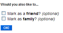
When writing instructions for your users, it's important that the messaging is clear. Here's a quick example when adding a user as a contact on Flickr:

When I first read this I thought to myself, "Who's Mark? I'm not adding Mark as a contact." It took me a couple seconds to realize that mark was a verb and not a noun. Including the contact's actual name as in, "Mark John Smith as a friend?" would have made it more obvious. Although, I think it'd be even clearer if it just said "Is John Smith a friend?"
Conversation
Make maybe? Identify? Label?
Would you also like to...
Add X as a friend.
Add X as family.
X=User or whatever
Make sense?
I'm not a huge fan of those question marks, either. Makes Flickr seem unsure about the decision :)
Very good point - I've completely overlooked this the many times I've run into this screen on Flickr.
It really goes to show you how much the narrative of websites play into usability.
It's this "Tonto-speak" pidgin English that people seem to think they should use whenever writing instructions to be displayed on screen.
Historically, there was a reason for it, in the 80x25 DOS days, you were often very limited in what you could fit in a certain text area, and even in the days of Windows or other GUIs on 640x480. Nowadays though resolutions are much higher and we have enough room that we don't need to speak like every sentence should end with ", Kemosabe."
In a word of IM and web pages with 2 paragraph articles where it seems many people don't even read books any more, I think it is no less important that we always communicate in complete sentences. Sure, it takes a little longer, but the improved communication is worth it.