Blick Blocky Retro
After a wild couple days, it's live. Well, live-ish. Blick Blocky Retro, the ninth iteration of this veritable site, has made its debut.
Why?
I've been working on this redesign for close to a year now. It has simmered, occasionally come to a boil, only for me to turn off the heat and step away from it. However, recent troubles with Dreamhost have finally made me flip my lid. The site performance has been sporadic with not-so-uncommon 500 errors and I just couldn't take it anymore.
Like a midnight dash to escape the rent, I've pushed this design live on a new dedicated server — well, old, actually. It's the server that powers SidebarAds. I also completely rewrote the site from scratch using CakePHP 1.2 — although this is still the beta. I haven't had time to update things, considering this last minute change.
What was wrong with Dreamhost?
For the longest time, I advocated Dreamhost and when i was on their shared hosting environment, things were simply peachy. Seriously. I experienced little to no downtime and decent performance. Then, they introduced a new server called Private Servers. It's supposed to offer more control over resources and better performance. At least, I think that's what it said. Instead, I got constant downtime, even when there wasn't much load.
I still have a bunch of other sites on Dreamhost and I have no plans to move those off any time soon. Moving sites is a hassle. For example, I screwed up the MX record when I changed DNS servers and received no email for 12 hours. Wheee! Thankfully, everything should be back to normal.
What about the design?
I should probably talk about the design, shouldn't I? Well, here it is. Obviously, this is heavily inspired by all the retro 70s chic that's going around. However, I wanted to take this redesign to simplify some things.
Splash Page
As some may remember, the "main" page of this site was at the /jonathan/ sub-folder. There was a splash page that had a brief introduction to who I am. Why did I have a splash page to begin with? Turns out, there's a story to that, and what's interesting is how often we see this happen in every web site.
The main page was originally a family portal with links to myself, my wife, and eventually, my first born. However, despite all my efforts, my wife never took on the task of writing and due to family concerns, the other link was removed. By this point, however, I had already established my section as the default place to go to. Any time I left a comment somewhere else, it'd point to my section, and not the index page.
A few months ago, while thinking that I'd get rid of the splash page, I've been using the clean Snook.ca as the URL that I leave everywhere. Now that the site is launched, I have finally gotten rid of the splash page and made it the main page. No more /jonathan/. Just / is okay by me. (Slash is okay by me, too).
It's three-dee!
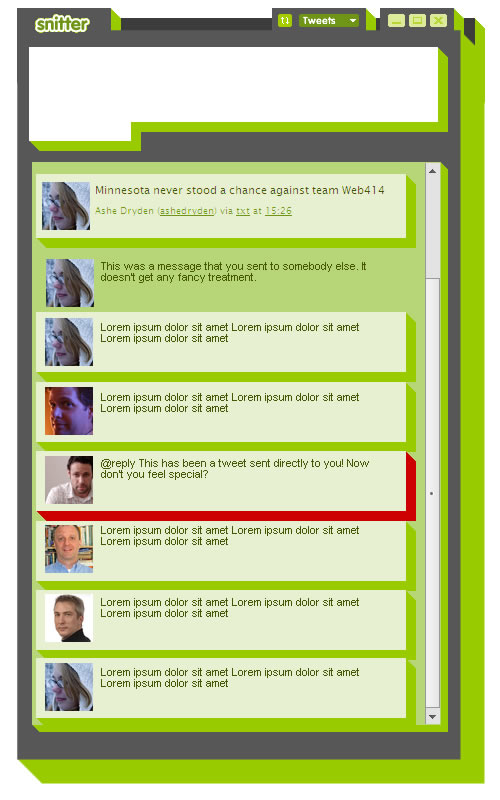 The original idea came from a design comp that I had put together for Snitter. I took that and continued to work it into what you see here before you. One of the interesting parts was trying to figure out how to get the elements to wrap. For anybody that has been doing CSS for some time, they might think, well, that'll be a couple elements with some a series of sliding-door images.
It seemed like a hassle. I didn't want to have a bunch of CSS to apply different background colours and I didn't want to have 3 or 4 elements every time I wanted to do an element that wrapped over the slanted edge.
My initial experiments started in Internet Explorer, since it's the largest hurdle. Get the hard stuff out of the way, as they say. Much to my surprise, IE was the easiest part of the equation. Using the matrix filter, which allows DOM elements to be manipulated, I was able to take an empty element and warp it across the slanted edge to get the effect that I wanted. Awesome! It even resized the element for me. This is all it took:
.transform { filter:progid:DXImageTransform.Microsoft.Matrix(sizingMethod="auto expand", M21="-.5"); }The sizingMethod property resizes the element appropriately and the M21 is one of the points upon which the transformation occurs. To be honest, I still don't quite understand how matrices work but I finally found a number that worked, so I won't complain. My skew was perfect!
But what of the other browsers? Canvas was the most universal solution I could think of. So, I set to work dropping canvas tags in all the wrap containers and applying a matrix transformation:
	var ctx = e.getContext('2d');
	ctx.fillStyle = bg;
	ctx.transform(1, -.5, 0, 1, 0, 0);
	ctx.fillRect (0, 20, w, h);
Notice the -.05 in there is exactly like it is in the IE filter example? Yeah, it's the same thing. Within a year, however, I'll be able to replace this code with CSS transformations. Webkit/Safari already support this and Firefox 3.1 is supposed to. I haven't looked at Opera support but it wouldn't surprise me to see it come down the pipe.
Multiply blending like Photoshop
Now, here's the other problem I ran into. While I had the elements wrapping, I still had to manually set the wrapped element background colour manually using CSS. Finally, in my desire to push this up live, I decided to find a better way. In this case, JavaScript.
In the original Fireworks design, I used the muliply blending option to create the darker overlap colour along the slant. I decided to do a little research to see if I could do the same thing with JavaScript. As it turns out, it's pretty easy: Take one colour value, multiply it by the other colour value and then divide it by 255 (the maximum colour value). The default RGB of the slant was (235, 242, 204).
I snagged the background colour of the original container and then split it into its composite parts of red, green, and blue. Here's the JavaScript magic:
rgb[0] = Math.floor( rgb[0] * 235 / 255 );
rgb[1] = Math.floor( rgb[1] * 242 / 255 );
rgb[2] = Math.floor( rgb[2] * 204 / 255 );
At this point, I decided to strip all the canvas tags I had in the template and moved it to the land of JavaScript. The script is now responsible for finding all the page containers, dropping canvas elements in, and making them look pretty. Then, if people don't have JavaScript, at least they don't see square elements in awkward places.
Didn't you say simplify?
Oh right. As I was saying, the simplification came both on the server-side — by rewriting all the code — and the client-side — with less content on the page and essentially a two column design instead of the 3 columns I had before.
With the backend getting a nice rewrite, much of the code has been simplified, uses more CakePHP idioms, and just simply uses less code. As a result, the performance of the site should be improved.
On the content side of things, I was beginning to worry that the sidebars were getting too bulky. Links to projects and books have disappeared but Delicious links now appear on every page. I might switch this up a little bit but haven't entirely decided now, yet.
It's not done
Despite all this, it's definitely not done. The comments, for example, were just thrown in so that people could get back to commenting. The design of which will change dramatically. I've also got a few other tweaks here and there that need to be made. But now that I'm on the new server, I can relax.
If you come across any dead links, by all means, let me know. I have literally 7 years of debris strewn about this site and I'm sure some of it got missed in the transfer.
It has been almost two years with the old design. Plenty of people liked it, and so did I, but I wanted to experiment and this is what I got. It's not perfect. On a technical level, though, I'm happy with it.
I hope you like it.
Conversation
Great concept and implementation, Jonathan!
One dead link - the slicing screencast from (http://snook.ca/archives/design/slicing-photoshop-fireworks) -- returns "Error: The requested address '/files/sc$this->normalizeEntities16bit("45")export.mov' was not found on this server."
I just noticed a weird issue, and apologies to anybody that has already commented but comments were getting over-written instead of creating new ones. It should be fixed now.
Great redesign. Completely different then the last one.
One problem on the homepage is that all the latest articles have the same text.
Congratulations on the redesign, it looks awesome. Great work!
@Dan: uploading the video now.
@Dimitris: Whoops. forgot to change a variable name there. Fixed!
@José: thanks for the compliment!
Hi,
I like the retro idea! love it!
but, I noticed something that looks unusual to me.
http://www.flickr.com/photos/filchiprogrammer/3200608189
Nice, I love the color scheme (probably because my site uses a variation of the same).. Your site looks better everytime!
@jojo_siao: It's meant to look "cut" because of the perspective used.. :)
huzzah! what a pleasant surprise to come here this morning to this new design.
nice work. :)
I dig the retro boxy look. Looks good Snook...looks good.
Groovy baby! Groovy. Dig the Atari 80's video game vibe.
Love the design.
Stumbled upon this site from an article on Smashing.
Instant bookmark!
On a few of the pages (for example: http://snook.ca/archives/business/) the "Snook.Ca" link's hover action creates a green background across the entire header instead of just the link itself.
great unique design, I like it :)
good job!
Very cool new design. It reminds me of an old site I used to visit...I believe it was cartmanland.com but has since gone offline.
I like it, although the text in the sidebar could be a little bigger.
The site looks great! I like the changes you've made since I saw it last.
Cheers!
Dreamhost has been pretty good for me (not my personal website but one client is on it), I hope the PS doesn't go downhill on me :)
Design and type just fit perfectly; I absolutely love the redesign!
Nicely done (once again), Jonathan!
You never fail to deliver refreshing change to an otherwise boring internet, and this design is no exception.
Design and type just fit perfectly; I absolutely love the redesign!
Mr. Snook, this is brilliant. There's something very ExciteBike about the look, which, well, I freaking adore. Great work, as usual.
Just what the internet needs! Something that doesn't follow everything else.
Great work, congrats :)
whoa ! this is totally psyched ! .. reminds me of Bee Gees 'Stayin Alive'
I guess I'll be the first to say I like the old site better! Nothing wrong with this one, it's fresh and unique, but overall the old one was smoother.
I think it's really strong. Nice work Jonathan.
Thanks everybody for the really great comments. I have to say I was a little worried pushing this out live.
@George: I understand what you're saying (I think). With that said, I have some changes coming down the pipe (when I have time) that should bring it up to where I wanted it and hopefully to the point that would bring your around from the old design. :)
So has your blog always been powered by cake or did you use wordpress?
@Jake Smith: It has been powered by CakePHP for awhile now. Maybe a year or two now. Before that it was Movable Type which I installed in 2003.
Loving it, especially the design on post dates. Wishing for #head{margin:0 auto;}, bigger click-area for #header link, and the triumphant appearance of site search.
I'd be interested in learning about your URL redirection since the departure from snook.ca/jonathan/.
And yay for dropping IE6.
I have to say, i'm with George - the old site was slicker.
Although, got to give it to you... this site is unique - i've not seen anything quite like it... ;)
I love it Snookums!!! The colors are so fresh. I also think the pattern you chose for the BG is perfect.
My only point is that I'd probably render "Snook.ca" in a custom retro typeface instead of just having it as normal text and in the same scale as the site description.
<3 it.
Wow, new look and its awesome. This is certainly unlike I have seen before.
I do agree with Lea on the logo idea, the simple text gets lost and without that "fancy S" its not the same.. even though I did notice it hiding in the footer of the web site.
Great stuff!
Amazing as usual ;-)
Congrats on getting the redesign out the door! Having just gone through the same process, I know it can be tough.
Glad to see everything is running smoothly now :-)
Loving the site, just one suggestion (not design wise).
I always come here looking for your CakePHP articles. But I could never find them right off the bat unless I do a Google search. Perhaps create a CakePHP article category?
Nice design.
Period!
When I saw your headers I was like what font is that!?!? Very nice use of Calibri, wishing it were more abundantly available to all who come here. It really makes the site.
Not bad. still need some work on the details though, but not bad.
I'd like a big[ger] 'Snook.ca' text (and maybe a font change) in the header and you might want to fix the logo in the footer for starters.
Looks awesome, Snook! I love the fact that you've kept green as a consistent centerpiece in each of your designs (that I've seen) so far. To echo the previous comments, this is something completely different and fresh. Great work!
Now I know, why you were a little bit slower with replying on emails ;) Great work! Gimme such too ;)
This retro looks cool too.. amazing work..
Loving it!
In all honesty, I wasn't too keen on the redesign at first, but haven't just read through an entire article, I'm falling in love. Great job, and I love reading about all the technical tricks used to make certain elements of the site work!
Hi Jonathan,
I follow your work since few month. This redesign of your site is the time for me to write some words too you.
Thanks for sharing your knowledges on CSS, your work is amazing. The new design of your website is great.
You're definitely the re-incarnation of god in the css world. [Maybe too much?!..sorry;) ].
Ps:I'm french, sorry for the bad english language.
@Miles Johnson: The categories that you see on the left are a subset of all the stuff I've talked about. It only shows topics that I've talked about within the last 6 months. With that said, I understand the concern and I might switch it up to show all categories.
@Andy: I went with the smaller snook.ca text in the header because I felt that I didn't need to sell it. I also liked that I could fit it into the 20px band quite snugly.
@Daniel Marino: I'm glad it's working for you!
@Detruk: You're too kind and your english is pretty good. No need to apologize!
Thanks again everybody for the comments, criticism and suggestions!
I love the new redesign. The new layout just has really good flow for navigating content (plus the tags column makes it really easy to jump around) - may have to steal some ideas. ;)
Wow, I really like this new design!!
Your old design was really good. This one's amazing!
I went to read an article, not expecting the design to have changed because it was already so good. The page loaded, and I though, "What? Why has it changed? Oooooooooh!! It looks so nice! :-P".
Normally when a site gets a redesign, it takes a while to sink in and get used to. This changeover seemed perfectly natural!
Also, well done on rebuilding your backend from scratch. These things take a lot of time, effort and debugging - even when you use Cake!
Well done, you've done a wonderful job!
It looks great. You kept most of the structure but freshed up the design. The curvy looks have a little from http://www.hicksdesign.co.uk/
It looks great. You kept most of the structure but freshed up the design. The curvy looks have a little from http://www.hicksdesign.co.uk/
Reminds me a bit of the http://acko.net/ theme. Pretty cool, though.
@K Don't remind me!! Gah, I've been sitting on this design so long that when I came across Acko, I almost scrapped it entirely. In the end, though, I felt my approach was still worthy of attempt and decided to stick with it.
It looks good, though I prefer the old design personally.
And congratulations on finally kicking the subdirectory. :)
Not loving the font used for content, but overall it's very unique and cool.
It is simple, yet pleasing to the eyes and the graphics create some depth. Awesome work!
love it. love the colors, the layout. everything.
gr8 job man.
hi,
I was checking out the source of the website (just a quick peek :) and noticed you use the html5 doctype. But there's no sign of 'new' html5 tags, or was my peek not long enough?
Anyways, very nice design!!
@Stijn Huyberechts: I could start using the new HTML5 tags but the need to use JavaScript to "turn on" the elements in Internet Explorer wasn't a great fallback for me. I'll hold off on that front for now. I'll leave it to the trendsetters to work out all the kinks. :)
As I relaunched my own site this morning, I found myself thinking "I wonder what Snook's site looks like these days." Funny that you have just relaunched as well - looks great!
New site looks good, but I'm still missing the magic of the old site...
Looking good, but when are you gonna walk to plank to Rails? You've been using Cake for as long as I can remember and Rails is the flavor of the week. ;-)
See you at SXSWi!
Another thing I noticed are your page titles. The sub pages/blog posts are on the title and dont have your name in it. Unless you did it that way on purpose :p
I really like the new design! Good work!
JS Error with your CTX stuff in FF2(hope this pastes okay):
ctx.transform is not a function
turnOnOffsets()snookv9.js (line 60)
init([div.container, div.container, div.container, 5 more...], function(), undefined)jquery.min.js (line 12)
init(function(), undefined)jquery.min.js (line 12)
turnOnOffsets()snookv9.js (line 11)
[Break on this error] ctx.transform(1, -.5, 0, 1, 0, 0);
Loving the new design...simply inspirational!
As for DreamHost....no point posting telling the world you hate them....everyone does :p
Seriously though, people pay for bargain bin hosting and expect it to actually be usable. When you can go elsewhere and pay a few $ more and get a very reliable service!
I recommend:
-JaguarPC (for shared)
-VPSLink or FSCKVPS (for VPS)
-ResellerZoom (for reseller)
-SoftLayer (dedicated)
Additionally I've heard people rave about MediaTemple, but never used them myself (Quite pricey!)
Anyway....love the new site, keep it up! :)
Good job, at first I did not notice the 3d effect.
Hi Mr Snook!!
I really really love this design, but I can't find a link to a RSS feed? Is there one?
Thanks!
Oh my gosh it's snook 3D!
Lovely design, very well thought out.
Try resizing your browser window in Firefox though..
@Phil what's wrong with resizing it?
Woah! I just visited the site and it look stunning mate. Kudos on the job.
Fantastic design. One thing I'm not sure about, though: I think there's not enough contrast in "Deliciously linked" section in hover state.
OK, I just tested it using your own tool (http://www.snook.ca/technical/colour_contrast/colour.html) and it doesn't pass :)
@Paul: Ha, yeah, there's no doubt some areas that could use more contrast. To be honest, though, the text is still readable. The hover state is indicating that it is actionable (while still being readable for — I suspect — the majority of people).
this is by far my favourite design. it's so fresh looking. and so 3Dish! wicked job mate.
I can't belive I missed the launch!.(read: slow on reading my RSS) loving the retro style!
A great piece of both design and explanation. I admire the late 70's design very, very much. Good job, man!
I really do like it alot. However, I find the archives on the left to be confusing how the run together (category and then yearly). Some sort of separation could be good.
I also preferred how you designed the author comment. I prefer being able to find your comments out of the bunch.
Where did you hide the link to the rss feed?
I like it. One thing - I seem to get a pattern misalignment as can be seen in the following screenshot. The bottom of the left column is misaligned with the rest of the pattern too.
Just ignore me if this is intended *grin*
Screenshot: http://www.baud.ca/snook-retro-screenshot.png
Neat design, I didnt notice the 3D effect till I scrolled into the comments section. And before I noticed the 3D effect I didnt like the design at all, however now its kinda neat!
The old sites 'fuzzy glow' was one of my favourite bits.
Great redesign. Completely different then the last one.
I'm the designer of the aforementioned Acko.net site... have to say, I love your design and it would've been such a shame if you'd canned it. Plus, I'm glad to see someone else used the trick of using canvas to render parts of the design ;).