Poor Form Design
Here I am in an airport in Detroit looking to sign up for wireless. A two and a half hour layover meant my time would be more enjoyable if spent online. But the sign up form certainly had some deficiencies. Here's a screenshot of a portion of it.
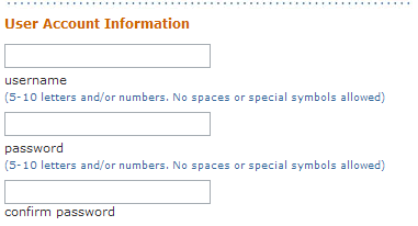
The designer probably felt that it just looked nicer if the label appeared under the field. I tabbed through the form (because using the touchpad on a laptop just isn't my picture of heaven) and then got to the bottom of the window. There was still more form to fill out but when I tabbed to the next field it scrolled just enough to reveal the field and not the label. I had no idea what I was supposed to fill out. I had to scroll down to reveal the rest of the form and then go back to the field I wanted to fill out.
From an accessibility point of view, the labels were not explicitly associated with the fields either. This would likely add confusion for screenreader users.
Put the label above or to the left of the field. Even if you don't associate the label with the field using the label element, you'll still make it easier for everyone to use the form.
With any design, it's important to think of your audience and how they'll interact with the site. If you're not sure what they'll do, put it to the test. Even just one or two people using the site as it's intended can reveal problems with the design.
Conversation
That is pretty bad form (good pun though!).
I recently took a course on man-machine (as well as human-human and human-environment) interaction; the emphasis was on aviation themes, but the ground rules still apply to design (where they're often ignored).
Designers should not just meet the average user's needs - they need to meet a range of needs, and they need to do it properly. The form example here is perfect - not only does it fail for visually-impaired, it also just sucks for everyday users. Pretty amazing that this passed the mockup stage.
Man, I can't stand forms on the web in general. I think it's jus because they're usually very poorly done. It gives away some of our biases as web designers. We care about our design, aka - what we're pushing to the user, but we do not value the user's feedback. Great example, btw.
This is actually one of the most practical, and well exemplified usability and accessibility articles that I have seen recently. Well written Mr. Snook.
Another example of this (in print) was on the customs form that visitors entering the US are required to fill out. Exactly the same problem - putting the labels under the actual space where you write the information.
I watched so many people fill in a second card rather than hand in one with corrections all over it. At least we can use the backspace on the web.
In fact, I felt directly to comment on this one. Stu Nicholls, the owner of http://cssplay.co.uk offered people to submit a well-styled form that validates and looks stylish.
Here is what I came up with, it is called shades of red. Maybe only for IE, some pseudo classes like :focus did not work. But other browers have their flaws too.
But what do you think:
http://www.cssplay.co.uk/menu/form.html