The YourTotalSite Redesign that never was
In helping out with YourTotalSite, Garrett had asked all of us to put together a design for a site. Alas, with the demise of the site, the redesign never saw the light of day. However, I'd like to take the time to show the designs that I was working with and some of the thought process behind it.
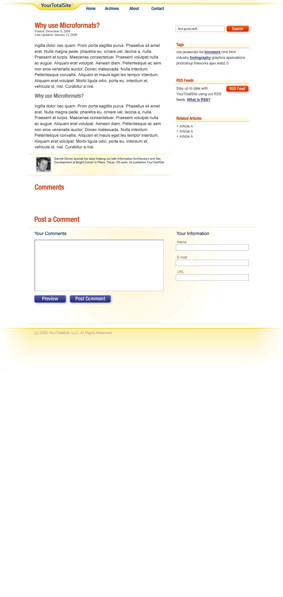
The first layout was a standard two column blog layout. Some key design elements included:
- The Tag Cloud: What's a site without a tag cloud these days. The way I envisioned it working is that you'd always see all tags that were available on a site. It was a quick and easy way to view all categories for a site. The tags that applied to a specific article would be in bold, blue, and underlined. It saved cluttering the content area with a list of tags.
- The Logo Tab: I wanted to keep the focus on the content and therefore I kept the logo small and out of the way. The home page design would have featured a much larger and more prominent logo but here on the content page, it was really about the article.
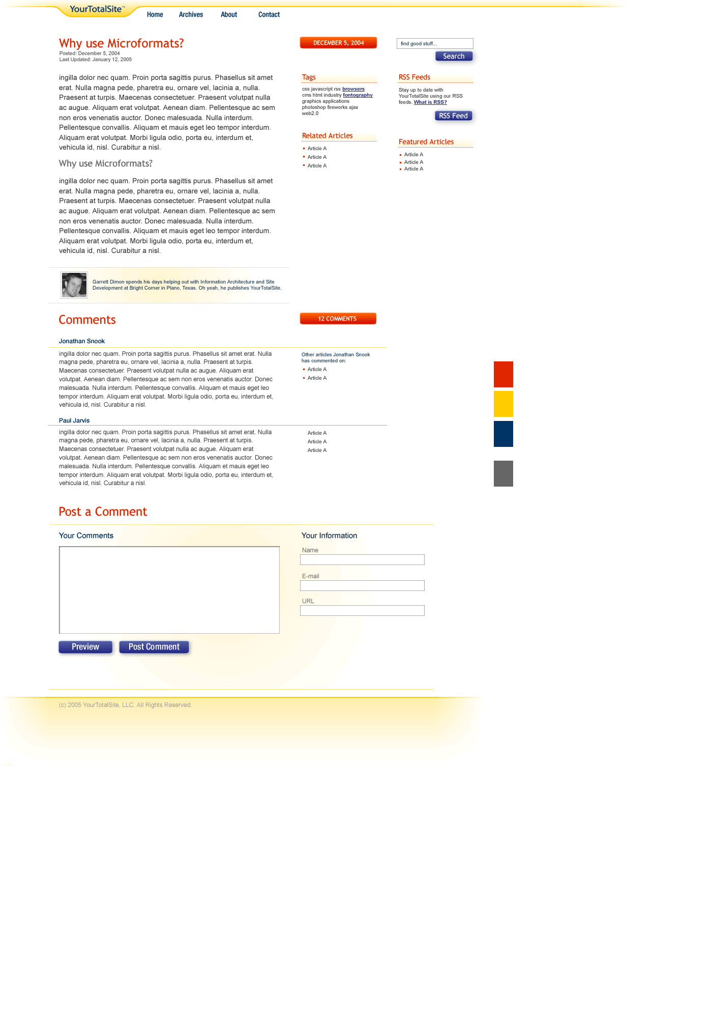
The second layout tried to branch off into a three column layout and featured a little more structure to the design elements. For example, buttons are always blue. In the first comp, they were orange in some places and blue in others. I also started thinking about fresh ideas, especially for the comments area. One way to do this, I thought, was to see a quick list of other posts that a person had commented on. My goal was to entice people to post on multiple articles and create more of a personal history within the site. From a new visitor perspective, it allowed them to quickly view other comments to see how consistently they presented an argument. In other words, was a commenter continually being negative or positive. I just wanted to create more of a context around each commenter.
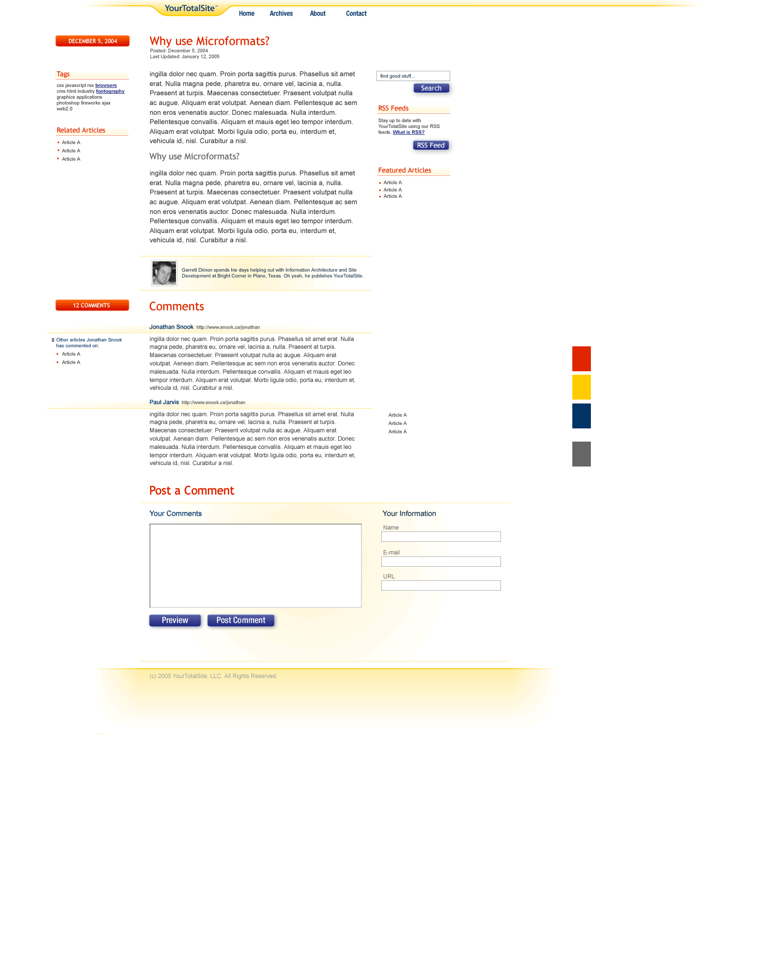
Finally, in the third comp, I moved one of the columns to the left of the content. The way it was intended to work is that the content on the left was more directly relevant to the content beside it, whereas the column on the right was more of a general column that featured content that wasn't directly related to any of the content on the page. For example, a page-specific RSS feed might be found on the left but a site-specific RSS feed would be on the right.
Anyways, I hope this provided some inspiration for you. It was certainly fun to work on and it would have been interesting to see the final product.
Conversation
It's sad that these never saw the light of day. Hopefully though, if YTS is ever re-started, you'll have a good starting point for a re-launch.
Sweet work man. Really nice comps.
You had to go and make me feel bad about shutting it down, didn't you? :)
Really though, nice stuff. I particularly really like the idea about seeing what other articles someone has commented on.
I think it might be a bit hard to implement precisely without requiring registration, but a simple match on name, url, and e-mal might be enough to do the trick.
I had planned to do it by email since most comment systems hide e-mail addresses. They're almost like "comment passwords".
Nice write up and nice comps. It's interesting the thought process you went through with each comp. Just like Garrett I really liked the idea of comment history. Anyway keep up the good work. Peace and God Bless.
Good job Jonathan.
Great consistency btw the old and new design.
I like the 1st comp best...
I really appreciate that because amidst the daily grind, it's daunting to think of creating layouts without getting paid for them :-). But I think I should create some of my own layouts. Thanks for sharing.
Very nice comps.
My vote is for #1 as well.
Jonathan,
I love the open look to these layouts. It will provide me with some good inspiration.
I like the first one best. It seems more 'together.'
Andy.
P.S. Nice fixed comments. ;)