Considerations in Component Design
In developing a component-based interface, how we decide to construct our components can sometimes make a considerable difference.
Consider this carousel design.
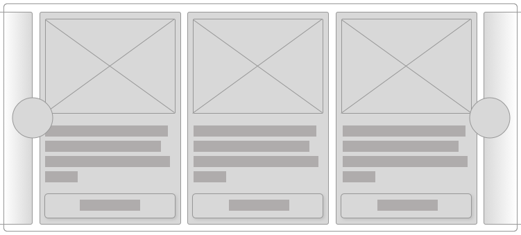
The carousel contains a number of items and includes pagination controls.
Let’s start with a very clean HTML structure with a single class to mark the container of our carousel.
<div class=“carousel”>
    <div>
        <div>
                <img src=“…”>
                <p>Item description</p>
                <a href=“…”>Buy Now</a>
        </div>
        <div>
                <img src=“…”>
                <p>Item description</p>
                <a href=“…”>Buy Now</a>
        </div>
    </div>
    <div>
        <button>Previous</button>
        <button>Next</button>
    </div>
</div>
The surrounding div provides the shell within which to scroll the items. The items are surrounded by a div, and each item is surrounded by a div. Likewise, the pagination controls are surrounded by a div.
It’s possible the HTML structure could be simplified or adjusted. Should the pagination controls be in a <nav>? Do the items need a surrounding <div>? You decide. This is the HTML I’m going with.
No Classes
We can go with this and try to style everything using the carousel class along with element selectors.
.carousel { }
.carousel > div::first-child { }
.carousel > div > div { }
.carousel img { }
.carousel p { }
.carousel a { }
This works because we have a known HTML structure that hopefully won’t change out from under us. Any changes to the HTML will require us to come back and revisit the CSS. (Which, in my experience, almost always needs to be done, anyways.)
If we only have one carousel design on our site, this is fine. If there are other carousels with different HTML structures, we’ll either get some messy selectors or we’ll have to come up with another set of CSS based off the new root. Like, .home-carousel.
BEM it up.
Let’s take a look at the HTML now with the classes applied to each item.
<div class=“carousel”>
    <div class=“carousel-items”>
        <div class=“carousel-item”>
            <img src=“…” class=“carousel-item-photo”>
            <p class=“carousel-item-description”>Item description</p>
            <a href=“…” class=“carousel-item-link”>Buy Now</a>
        </div>
        <div class=“carousel-item”>
            <img src=“…” class=“carousel-item-photo”>
            <p class=“carousel-item-description”>Item description</p>
            <a href=“…” class=“carousel-item-link”>Buy Now</a>
        </div>
    </div>
    <div class=“carousel-navigation”>
        <button class=“carousel-navigation-button”>Previous</button>
        <button class=“carousel-navigation-button”>Next</button>
    </div>
</div>
The CSS ends up being a collection of simple class selectors.
.carousel { }
.carousel-items { }
.carousel-item { }
.carousel-item-photo { }
.carousel-item-description { }
.carousel-item-link { }
The design of the component, however, hasn’t changed. We’ve just chosen to use class selectors instead of element selectors to reach the elements we care about.
Depth of Applicability
In SMACSS, I talk about the Depth of Applicability. When I originally wrote about the concept, it was about how the selectors we use establish a link to a specific HTML structure. The further the distance from the parent to the deepest descendent element, the more complex and rigid the HTML structure needs to be for the selectors to work.
We also run the risk of styling things we didn’t originally intend to style. By using simpler selectors, we remove the dependence on a specific HTML structure.
However, in the years since, I’ve extended this to also consider the depth of the HTML structure itself with regards to component design.
Our links, for example, are 4 levels deep (if we consider the root of the element the first level). It’s not hard to imagine the HTML structure of the carousel items going even deeper.
Component Boundaries
Likely through my own experience having done this for a number of years, but my general rule of thumb is that if the component is more than 3 levels deep, it might be up for breaking apart into smaller components.
Why break it down into smaller components?
Smaller components allow for easier reuse. We can use individual pieces in other contexts much more easily.
When developing or designing within a specific context, it might seem like this is a unique component and thus doesn’t need to be decomposed into smaller components. And it’s true that that may very well be the case.
However, I often see where the design of one component is similar enough to a design of a part of another component, that we can take the time to solidify them into one and the same.
Going back to our carousel example, we have 3 or more individual components that can be used to build the larger interface. How you decide to break these down will be based on what you know of the rest of the design.
For example, the pagination controls might be a button style that you might use elsewhere. Or it may be very specific to this component. I could go either way on this, depending on the design.
The carousel item, however, is a pretty common pattern that I see in a lot of designs and it might make sense to break this down.

In an older version of the 5by5.tv web site, there was a carousel at the top and a list of shows in the main content area. The presentation of the items were very similar.
Let’s break the items out into their own component, then, and call them cards.
.carousel { }
.carousel-items { }

.card { }
.card-photo { }
.card-description { }
.card-link { }
We haven’t created any more or less CSS. We’re still defining the same properties and value. The only thing that has changed is the name of the classes that we’re using. However, by breaking this down into smaller pieces, we don’t have to come up with possibly unwieldy class names.
If we use 5by5.tv as an example, the photo treatment of the white padding and the gray border is used in a number of places. Not just within the card.
The button style that has been applied to the links is likely to be used elsewhere. We can, therefore, break that out into their own components.
.carousel { }
.carousel-items { }

.card { }
.card-description { }

.photo { }

.button { }
Recognizing this pattern is something that I see many people struggle with. Once we get past the initial shell of a page, I find that people look at chunks of the design is just that: large chunks of design that need to be coded as one thing, rather than break it down into smaller components.
The 3-levels deep rule can be a good indicator to reconsider your component design.
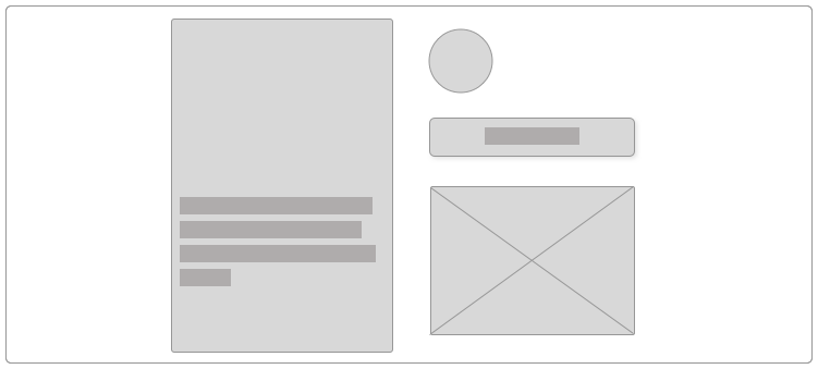
The Shell/Content Pattern
The other common pattern that I often see is what I call The Shell/Content Pattern. Often, there’s a shell, a container, that might have some design to it, and then the content that goes within that.
The shell usually falls into a header-content-footer sub-pattern. Although, it’s not unusual for it to not have either a header or a footer.
A modal dialog, for example, has a header, content, and footer.
Going back to the 5by5.tv example, the carousel has a header (the New ribbon), content (the shows), and a footer (the link to more new episodes).
Going back to our carousel, there’s the content (the cards), and a footer (the pagination controls).
This pattern can be a great way to recognize when to break things down from one larger component into a few smaller components.
Biggie Smalls
Component design is a bit of an art. How you decide to define the boundaries between one object and another can be very subjective.
Recognizing Depth of Applicability and the Shell/Content Pattern are just two ways that I use to help me decide when to decompose my objects.
Conversation
I think each item in the carousel should be a
figureand the descriptions should befigcaption.