IE8 bug with max-width and overflow
Just a quick documentation of this interesting bug. This only happens in Internet Explorer 8 (but not 7 or 9), which was interesting. If you have an element with long text but it has white-space:nowrap to prevent text wrapping with a max-width and overflow:hidden to clip the overflowed text, then a floated container (which should collapse to the width of the content) will collapse to the width of the text as if it was not set to be clipped. The use of text-overflow:ellipsis has no effect on this.
Here is the text case:
<style>
        #a { float:left; border:1px solid blue; }
        #b { overflow:hidden; max-width:50px; border:1px solid green; white-space:nowrap; }
    </style>
<div id="a">
        <div id="b">here's a really long string</div>
    </div>
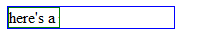
As the screenshot from IE8 shows, the floated container doesn't collapse like it should.
Solution?
In this particular case, I was able to add a max-width to the container so that it only expanded as far as the content contained within would expand.
Conversation
Do you have the option of moving the max-width to the parent?
That's a good question, Niccai. In my particular case, I needed different max-widths for the inner element and the outer element because I had other things going on in the container. But I imagine putting max-width on just the parent would work fine.
Hopefully IE8 support will drop once IE10 releases. Much like Google, I only see the need to support the latest 2 versions of a browser unless client needs or market dictate otherwise. Nice to see there's still some learning to be had with these older browsers though.
A max-width of what?
Interesting, thanks for pointing this out!
Cheers pal. I do appreciate the wiritng.
Get familar because as long as win xp exist there will be ie 8. Probably should focus on ie8 bugs the rest of the browsers are advancing so quickly we don't have time to worry about there quirks.
That's a good article. Thank you for sharing it with us. Just keep it up!
thanks! that's another reason to hate IE8 :)
Good olde IE8 :)) , Ivan @ souplantation coupons
Great thniikng! That really breaks the mold!
Add a width as well to the floated element, if you have the element in a table cell - we found that:
overflow:hidden; max-width:50px; width:50px; ...
stops the table cell from expanding to the width of the hidden content text. This also allows another element to float to the right of the content. It seems to be the word-wrap property that causes IE8 to go a bit funny.
...Mental.
Hi bad solution
Hi Jonathan,
I have a similar problem with IE 9 (previous IEs as well I suppose).
I have a table with just two columns, one that should be limited to, say 50px, and the other expand the rest of the table. For white-space normal everything works ok, but I need white-space: nowrap. IE just does not want to obey the max-width property in this case.
Here is the jsfiddle http://jsfiddle.net/yCWjj/2/
Do you have a suggestion?
I would appreciate any feedback.
Thank you
Yea, with tables, you get different behaviour. In fact, I'm surprised that your table is @Radu: rendering okay in all the other browsers. The way I've fixed this in the past is to put the contents in a div and set the overflow on that.
This was a great find, thank you! I like the sollution I couldn't quite come up with a better one myself as fast :)
Ran into this bad boy, thanks for the fix and explanation!
This solutions is not working for me.. I am using IE 9