Overlapping Header with CSS Grid
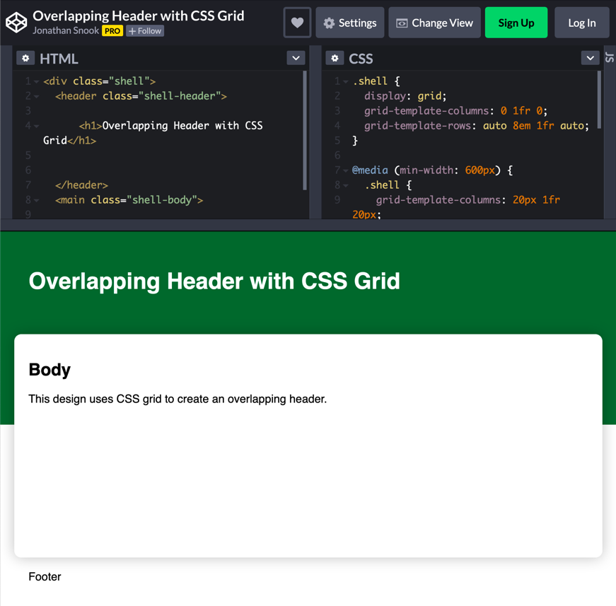
I have this design.

Historically, I’ve done this with negative margins. The header has a height that adds a bunch of padding to the bottom and then the body gets a margin-top: -50px or whatever the design calls for.
Since I knew I was going to be using Grid for the shell of this page, I wondered if there was an easy way to do this.
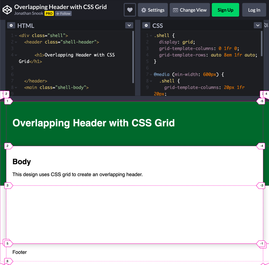
I set up the page using three columns and four rows. The centre column is where the header, body, and footer reside. The left and right columns are the gutter, which—based on this particular design—I want to collapse on small screens.
The header goes in the first row and the footer in the last. (Firefox has a great Grid visualizer, by the way.)

My first instinct to getting this to work was to have the header span rows 1 and 2 and have the body span 2 and 3. The problem here is that the header content won’t push the body down if things need to reflow in the header.
You can mitigate this by adding enough padding to the header equal to the height of the overlapping row.
grid-template-rows: auto 8em 1fr auto;

.shell-header {
  padding-bottom: 8em;
}
Now, that’ll definitely work just fine. However, because I had collapsing margins for this design, I wanted the padding for the header to line up with the body. I can use media queries to adjust the padding for small and large screens (as well as the media queries for collapsing the margins).
I decided to take a different approach that let me leave the padding alone. I added an element for the background colour and stretched that over the first two rows:
/* overlap */
.shell:before {
  content: "";
  grid-column: 1/-1;
  grid-row: 1/3;
  background-color: #063;
}
Because I’m using :before, it should automatically be behind everything else. If I used :after, it’d be on top and I’d have to use z-index to get it back behind everything else.
Just like that, I have an overlapping header. Check it out on CodePen.