Playing with CSS Grid
I’ve been working on this site, Fifty, to track a list of restaurants that I’ve been to. Each new restaurant was a list item. The list will eventually reach 50 items and a long list is long and visually uninteresting.
The first attempt was to use CSS columns. I threw on a column-width and bam. Slightly more visually interesting—at least, on larger screens. It’s still just an ordered list on smaller screens.
Lately, I’ve been wanting to play with layout that had more of a magazine feel. (I’ve also been wanting to do an actual magazine but that’s a story for another day.) I even picked up a stack of magazines from the local bookstore to get some inspiration and ideas.
One thing that I noticed is that they’ll play with grids to create visual interest or to move your eye through a more dense page.
Magazines have the advantage of a fixed size. For the web, we need to consider everything from watches to wide screens. CSS Grid seemed like a great way to play around with different options.
Repeat
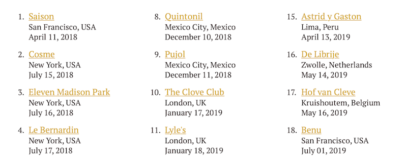
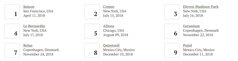
Grid’s repeat function is one of my favourite tools. It’s like a built-in responsive design tool that instantly creates a flexible design. I tell it the minimum column size and then it will create the number of columns that’ll fit into the space allotted.
grid-template-columns: repeat(auto-fill, minmax(250px, 1fr))
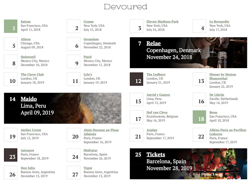
This, in and of itself, isn’t much over what I had before. I beefed up the style with some numbers in boxes.
Spanning Columns and Rows
To make things more interesting, I wanted to have items pop out, both in size and colour. If everything popped out, it would be overwhelming and I didn’t think it’d make the list any easier to parse.
I decided to create a pattern that would work when I had a few items and would continue to work as I completed restaurants on the adventure.
The first idea I had to make certain items stand out was to have some restaurants take up two columns and two rows and include a photo.
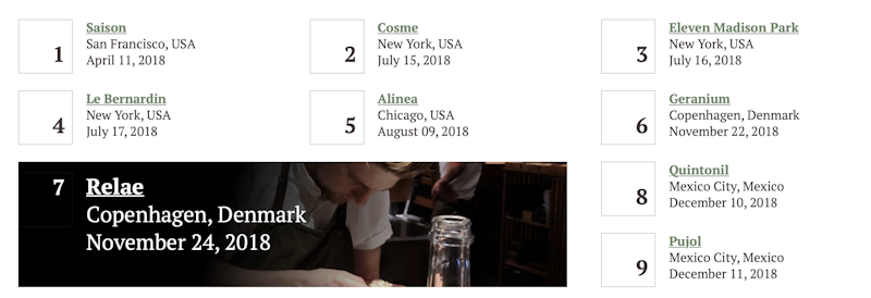
I specified the row and column span:
grid-row: span 2;
grid-column: span 2;
A problem reared its ugly head when the page scaled down to a single column. Why is this a problem? By spanning an item over 2 columns, there will always be 2 columns, even if I only want 1.
I’d love a way to say: grid-column: span minmax(1,2). It’d take two columns if there’s two columns; otherwise, it only takes one column.
Instead, I had to define a media query for when there was a single column and adjust the spans for that.
@media (max-width: 674px) {
    .restaurants li {
      grid-column: span 1 !important;
    }
}
(I probably should’ve done this mobile first and defined the default as span 1 and then did a min-width for anything that wasn’t mobile. But it’s a personal site and whatevs.)
I played around with what would create the best look at all viewports and with various items. I wish I could say I had a magical formula but it was really just trial and error. I’d put something together and then resize to see how it’d look. Then play around with the numbers until I had something I liked.
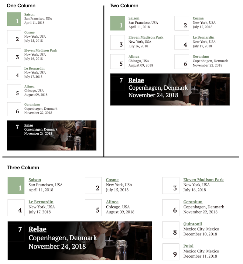
The next problem was to make it looks semi-random. Or provided some alternation with where the spanned items would be placed. If I just use :nth-child then weird patterns can emerge at different viewport widths.
To solve this problem, I’d use multiple :nth-child declarations with alternating offsets. This provided the best results over all viewports.
Random colours
I was okay with that but I wanted more. I decided to use the alternate colours, green and brown, on random boxes. CSS doesn’t have a random function, which would’ve been really handy here. Instead, I tried to figure out what offset would create a pleasing pattern. Again, this was a lot of trial and error figuring out offsets that worked well.
.restaurants-devoured li:nth-child(17n-16):before { … }
.restaurants-devoured li:nth-child(11n+12):before { … }
And again, I used a similar solution to how I placed the large boxes. Offsetting numbers with multiple patterns helps create the illusion of randomness.
The Result
I’m really happy with the way the grid turned out. Probably the biggest problem is that people look for meaning in patterns. “Why are these restaurants a different size or colour? Are these the ones you like best or stood out to you for some reason?” The answer is no, there’s no significance. I thought it would look nice. Unsure how I’d tweak the design to make the insignificance more obvious.
I look forward to going to more restaurants and seeing the grid continue to fill in.